
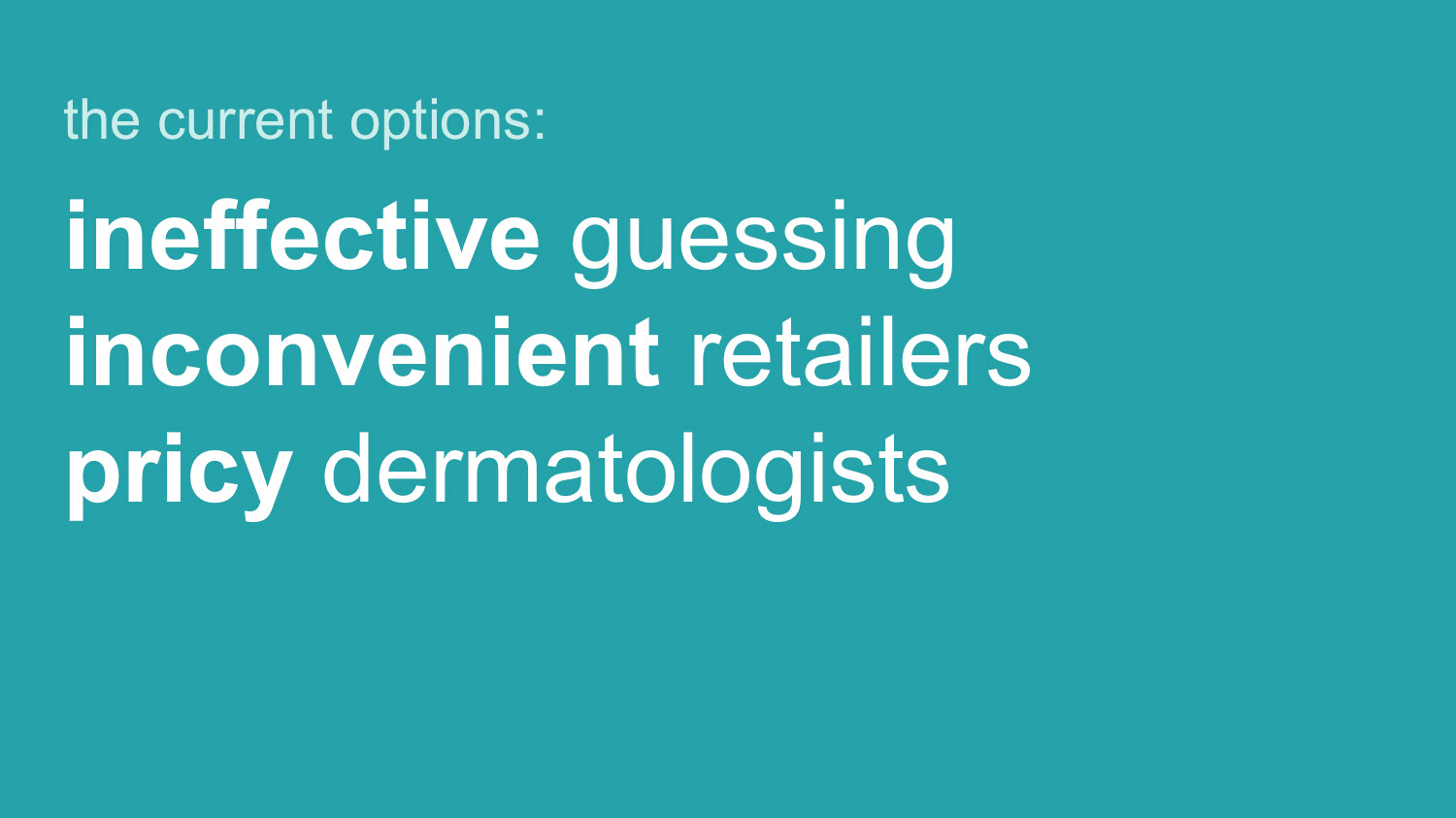


Explanation of choices
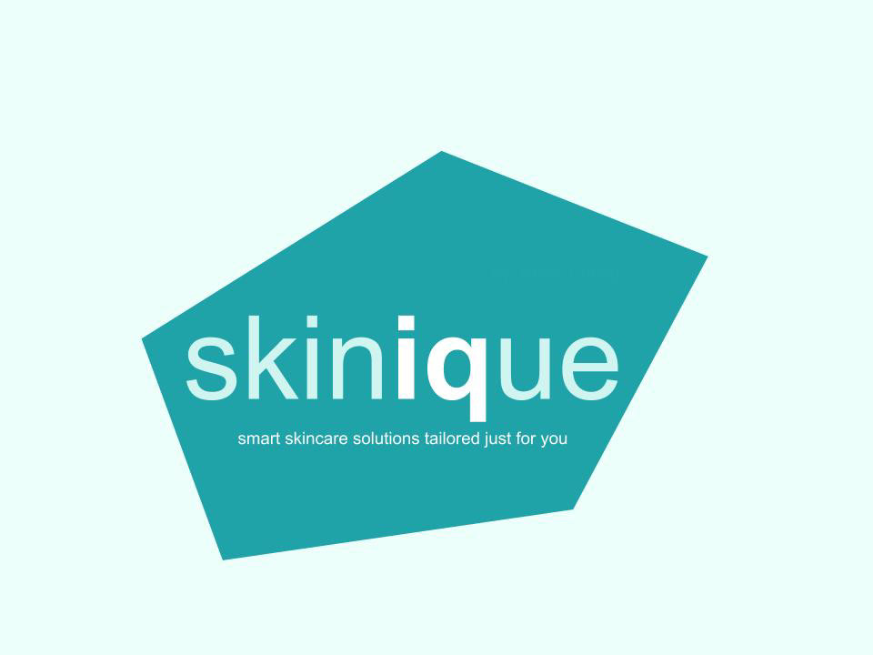
The goal of the proposals design was to display the professionalism and youthfulness of the brand. These qualities were selected for the younger demographic was the most likely to the experience confusion that our product addresses and is tech savvy enough to look for the type of solution our product provides.
The reason professionalism is emphasized along with youthfulness is that given the brand is targeting such young demographic, the design of the product had to look professional enough for parents to find it legitimate.
I chose to use a clean font and a teal and charcoal color palate to mimic other better known skincare brands in an attempt to claim authority. The pentagon logo and design feature is inspired by the shape of skin cells in the epidermis.