Overview
Purpose — This project aimed to strategically analyze NanaWall's operations and create a native app, to enhance their services and provide long-term financial value.
Challenge — Through competitive market analysis, stakeholder mapping, and an interview with a NanaWall sales representative, we found that the largest inefficiency in NanaWall's service was in the experience and ability to cater to Residential Customers.
Currently, residential customers of NanaWall account for 50% of employees' time but contribute minimally to their profits. The root cause of this inefficiency lies in the difficulty of accessing information about NanaWall's pricing and features. To learn about features and pricing, individuals must contact a local representative, often requiring hours of travel to visualize products in their own homes.
Furthermore, as information is exclusively exchanged via phone calls, NanaWall is unable to collect real-time data on users' preferences for predictive analysis on the needs of this consumer base.
Solution — NanAR, an AR-enabled app, addresses this by serving as an information hub for residential consumers, streamlining purchase planning, product exploration, and preference communication to rectify the information imbalance.
Team
Celine Chang
Michael Silvestre
Danielle Shoshani
Roxanne Zhang
Contribution Highlights
Design — I collaborated to develop a smooth try-on experience focusing on balancing efficiency and delight. This was one of the first projects where I had enough iteration time to push into developing thoughtful microinteractions and see the benefits of those actions.
I developed a data hierarchy to ensure that user data was transformed through the system in an understandable manner.
Additionally, I pushed for search features to be integrated into the app, tying the product better to its need.
Research — I led and initiated company interviews, enabling our group to develop a user needs-based solution instead of an assumptions-based solution.
Teamwork— I successfully introduced a process to assist group dynamics, increasing overall idea contribution and supporting the team’s process.
About NanaWall
NanaWall is a company that makes bi-folding glass doors, Actually, they are the company, our competitive analysis research found that NanaWall was ahead of its competitors in terms of its product development. Winning many awards.
Their voice as a company can be described as innovative but not eccentric, cutting edge but not flashy, luxurious but practical.
However just because the company is innovative in the bi-folding glass door space, does not mean they are in all way’s revolutionary through research in the discovery phase we were able to identify clear holes in their service.
Challenge
This project was an assignment from Interaction Design Studio II, where we were expected to analyze a company and develop a solution that would improve their service. In short, we would be answering the question:
How can technology be used to improve NanaWall’s service?
.
Process
To figure out how to improve the NanaWall service, we used a double diamond process. First, discovering the right thing to make, and then ensuring that we made it right.
DIsCOVER
Approach
Our group began this project with no knowledge on the subject of NanaWall or their service. To build an understanding of their service to pinpoint an appropriate solution we did the following:
Competitive Analysis — Understanding NanaWall and their competitors to know where NanaWall had relative room for improvement and where their strengths were..
Voice Analysis — Lifting and expressing NanaWall's Company Voice to ensure that any solutions developed would be on-brand.
Stakeholder Diagramming — Diagramming the company and all related entities and the information and value that flows through them to know where intervention could be helpful and where stresses are.
Contextual Interviews — Interviewing NanWall employees to gauge an insider understanding of the process from an inside POV.
.
Findings
In completing these methods, we came up with four key findings built on insights and evidence that shaped our Final Project.
/
1. Lack of transparency makes residential consumer interactions frustrating and unprofitable.
Prices, models, and installation are not available on the NanaWall website, so all customers must learn this critical information from conversations with local representatives.
For commercial contractors who purchase large quantities of NanaWall’s the cost vs labor, balance is reasonable. On the other hand, since residential consumers usually only buy one NanaWall in their lifetime, residential customers' purchases take up a disproportionate amount of labor.
"Residential consumers make up less than 50% of profits, but they take up over 50% of my time because they are unprepared."
NanaWall Local Representative
m

.
2. Poor Accessibility of Models Burdens Consumers
NanaWall showrooms are often difficult for customers to visit without extensive travel (4+ hrs), making it hard for them to visualize what the product would look like in their space.
"Going to a showroom is a trip for most people. Because it’s such a large purchase, I try to find NanaWalls in the wild to show them, but I rarely find the exact model they’re looking for."
NanaWall Local Representative
.

NanaWall showroom locations are far apart, making seeing a given model of NanaWall in person difficult.
.
3. Excessive forms before contacting a local representative discourage purchasing
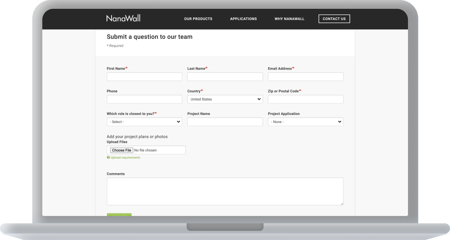
In order to contact a local representative, the key to all information for a residential consumer, one must enter a series of forms on the NanaWall website.
Putting this point of contact behind levels of barriers makes it more difficult to make the conversion between interest and purchase.
,,,
.
4. Low Predictive Information makes informed production choices unattainable
There is no real source for NanaWall to use to track the decision process as it is all done over the phone between the local rep and the resident.
As you can see from this stakeholder diagram, residents (residential consumers) and designers at NanaWall are not connected to each other, highlighting the lack of information transfer between these groups.
,

Stakeholder Diagram, NanaWall Residential Consumer. - Highlights separation of designers and residents.
..
oPPORTUNity space
NanaWall may make glass walls, but it's a lack of transparency that blocks them from improvement.
With these four findings in mind, we explored the solution space focusing on the concept of transparency. We needed to increase the transparency of information from NanaWall and residential consumers, in order to increase company profitability, consumer experience. All while keeping the experience delightful and in line with the company's image.
DeFINE
Approach
In order to define our ideal solution we expanded our ideas of what could be possible and then highlighted the key changes we wanted to see happen.
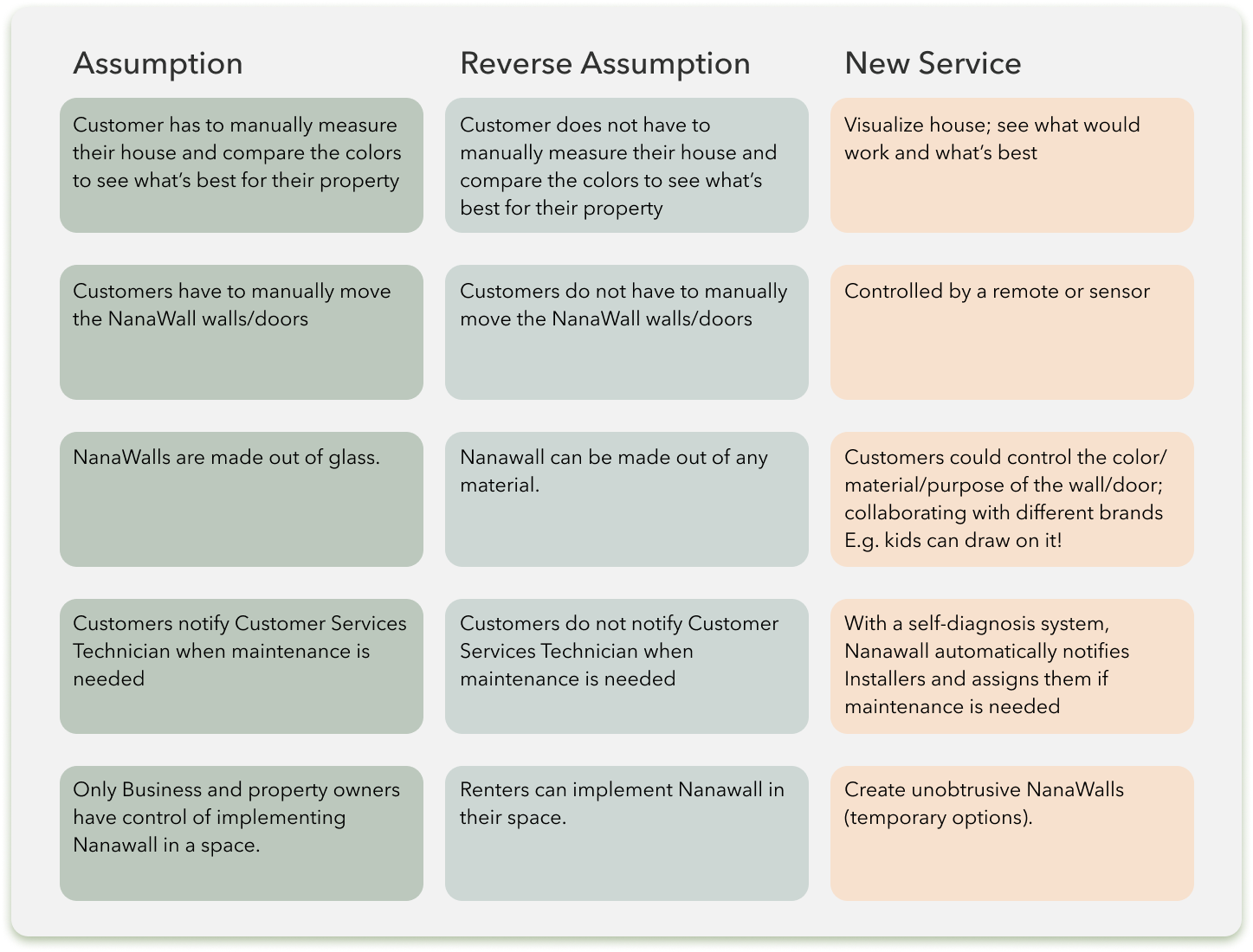
Reverse Assumptions — Reframing the findings above into reverse assumptions, enabled us to quickly create a prioritized solution going forward. This was my first time using this approach, and it is now one of my favorites.
bb
..
Successful Solution Requirements
1. Allow customers to view products in their space (2)
2. Share consumers’ spaces and preferences (1,4)
3. Allow option Exploration with nomenclature (1)
4. Show product cost and constraints prior to contact (1,3)
5. Enable easy local representative contact (3)
(Findings are #)
..
Solution Definition
In order to fit these key requirements in one product, we realized our solution needed to be…
An AR-enabled app with product try-on that collects and distributes user metadata, displays product information, and powers conversations between residential consumers and local reps.
Design
Approach
Think-Aloud User Testing — Each iteration was tested for usability, understandability, and delight. These interviews showed our blindspots.
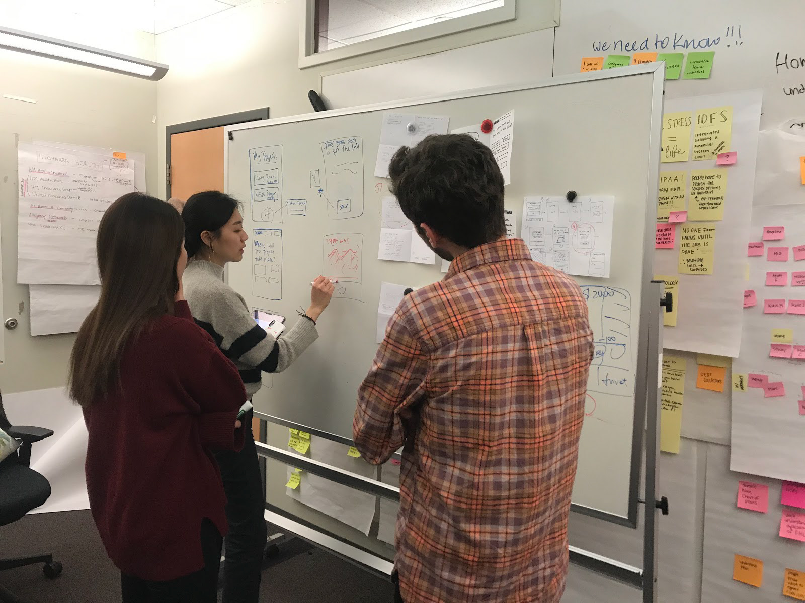
Parallel Design — Instead of brainstorming the interface from scratch together, we individually produced rough sketches of the flow and then regrouped to discuss everyone’s visualization of the flow. After discussing each feature, we drew the “final” lo-fi sketch by mixing and matching different aspects of everyone’s ideas.
Context: I suggested this process as I noticed that our group had a tendency to let some individuals have more say than others and knew that we as humans tend to overestimate the amount others agree with us.
Outcomes: This method was super successful for our group, and was listed as one of the best things about this process!
.
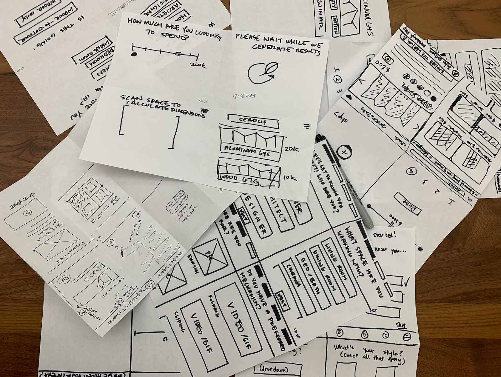
- Iteration 1/5
Iteration 1 dESIGN
Our initial version of the app flow began with a series of 5 questions designed to collect all of the information necessary to filter options based on our local representative interviews and understanding of the process.
.
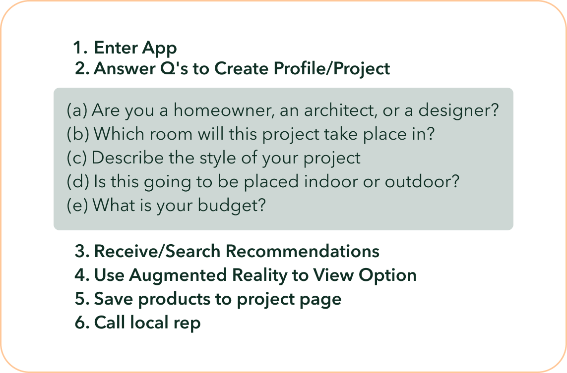
Flow for Iteration 1
.
Iteration 1 Feedback
We found during initial tests that users universally found this part tedious and wanted to get to the part where they could see the items.
“How many more questions are there?”
User Testing Participant
This consistent feedback showed us that we were asking too much of users and we're not prioritizing their experience.
- Iteration 2/5
Iteration 2 Goal
Ask Less of Users (Collect Data Organically) & Prioritize Joy
Taking in the feedback from before, we realized, though transparancy is important, we cannot overburden our users.
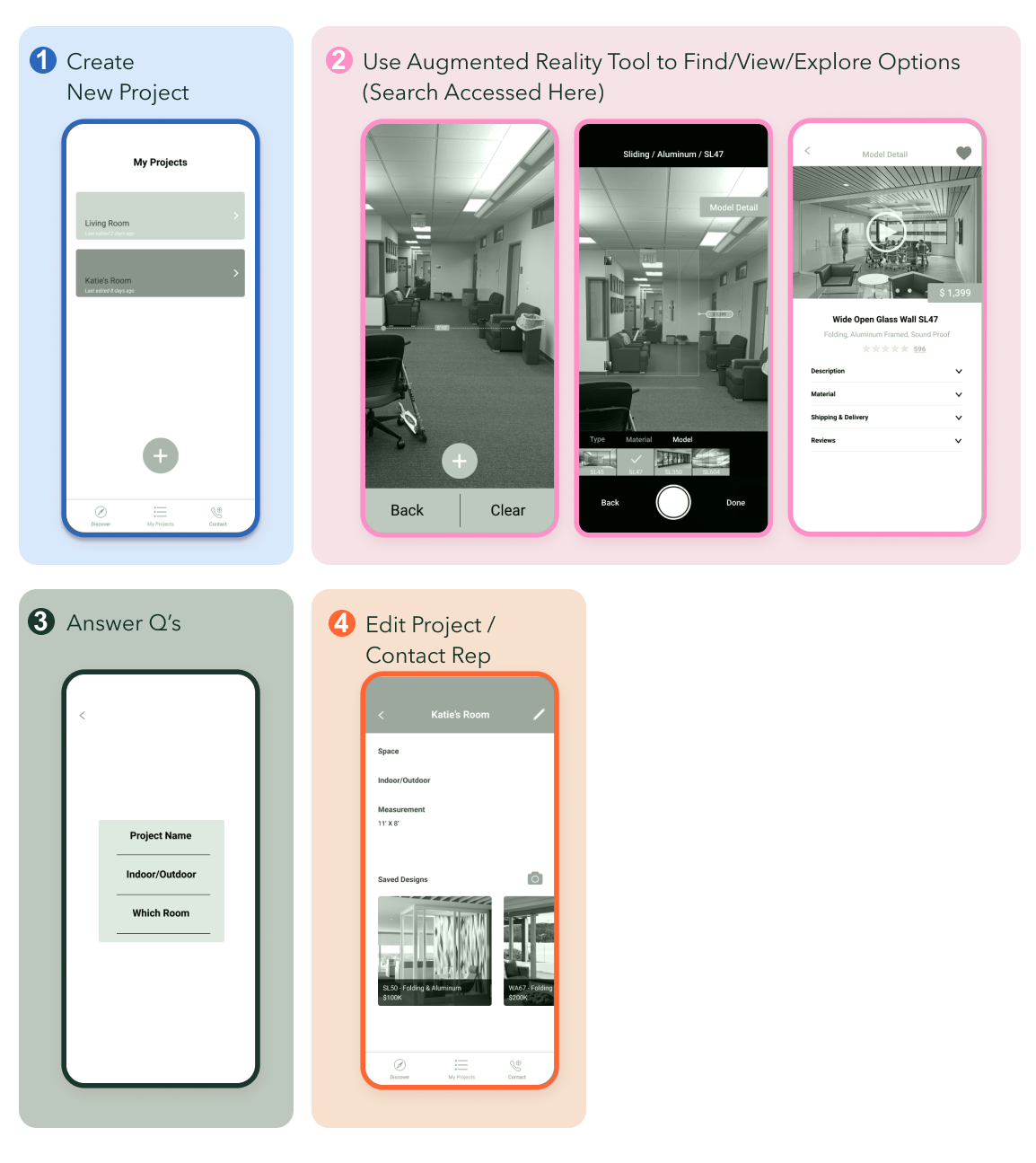
Iteration 2 dESIGN
To lessen the burden of questions we employed two tactics:
1. Put the Fun Part First - We reordered questions within the user flow to points after the “fun part” (AR Try-On) and placed them at more organic points to better cater to user expectations.
2. Ask Minimal Explicit Questions - We limited the amount of data that we asked for explicitly to save effort and increase enjoyment. Utilizing implicit data for the question of preference.
,
.
Explicit data is data asked directly in a user task, something effortful, whereas implicit data is data that is learned through other means.
In this iteration we collaborated to identify exactly what data we needed to collect to meet our design goals, and then kept only the questions that had to be asked explicitly in that manner.
Explicit data collected: Name/Number of User, Measurements (as a double check). Name of room w/ NanaWall, Whether the project is indoor or outdoor.
Implicit data collected: Location (via phone data), Consumer Preferences (via searches, saves, and written in-app communication).
- Iteration 3/5
Iteration 3 Goal
Use Prior Knowledge and Collaboration to Create a Look Consistent with the NanaWall Brand
From our initial research we found that NanaWall's voice as a company could be described as innovative but not eccentric, cutting edge but not flashy, luxurious but practical. We also knew that the key color in their design was green.
So, to figure out what this app was should look like everyone came into the meeting with a mood board encompassing what they imagined the NanAR app would look like given our prior research on the brand of NanaWall using the parallel processing method before we condensed our ideas into a singular color palate.
.
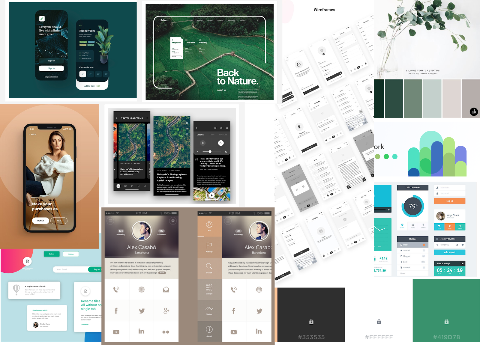
Mood Boards
.
From there or each member created their own version of the home screen is that screen has all the visual elements that would be on all of the other screens.
Comparing the screens allowed us to generalize and come to a consensus upon what the app should look like (color distribution, fonts, shape, etc)
Iteration 3 Design
Calming shades of green and orange to reflect the brand's colors as well as its innovative but not flashy style.
Repetitions of geometric shapes and dashed lines to reflect the building nature of the project like a blueprint.
-

Home Page Attempts (Small) and Final (Large)
- Iteration 4/5
Iteration 4 goal
Maximize intuitiveness of product visualization through strategic internal hierarchy and external presentation to Improve the Functionality of Try-On Screens
Additionally, to service the simplification of the try-on page, we all came with the hierarchy of NanaWalls products as per their website. The thought being that we would be able to find a simple sorting pattern instead of overloading our screen with filters and option.
We wanted to have even large groups of items so our initial inclination was to split it up by functionality as those groups were the largest therefore going into the next presentation we wanted to make sure that the interactions on that screen were sorted by that hierarchy.
-
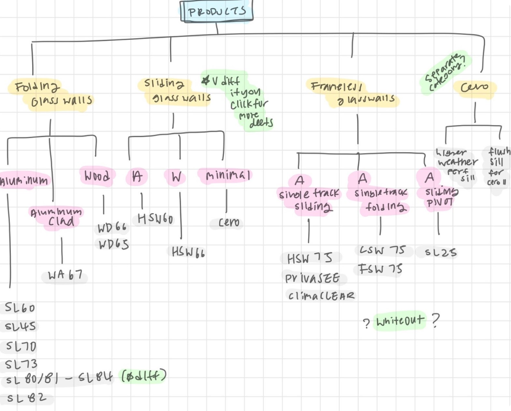
Higherarchy Used for Simplification of Try-On
.
With what needed to be on the AR search filter settled for the moment, we assigned individuals to create screens with two people (Celine and I) Working separately on the AR screen in the search screen as those screens, or do you have the most complex and important and we wanted to have more options of how they were going to work as it seemed less straight forward.
,
Iteration 4 Design
Moving into high fidelity we combined Celine and I navigational systems to create one that has the best of our designs.
Our aim was to have the least visually obstructive interface while remaining in style and having all of the information needed to improve performance (model name, price, search, filter)
.

My Sketches of Try-On Before Meeting & Development of Try-On Screens (all iterations above were done by me)
,
Mid - High Fidelity Iteration of Flow
-
With what needed to be on the AR search filter settled for the moment, we assigned individuals to create screens with two people (Celine and I) Working separately on the AR screen in the search screen as those screens or do you have the most complex and important and we wanted to have more options of how they were going to work as it seemed less straight forward.
Iteration 4 Feedback
Talking to our classmates helped us realize that we were wrong about our sorting hierarchy as our solution only considered the data and not the users. Users suggested we sort by material instead of function they would be looking for the "vibe" of items when imagining options with Nana wall and the material was a better conveyer of "vibe" as it is what users thought was most crucial to something working in their space.
- Iteration 5/5
Iteration 5 goal
Finalize Design For Users & Stakeholders
Besides the "vibe" content change, this stage was generally was about perfecting our design by making sure minor details aligned with the brand's voice (ex: changing likes to bookmarks).
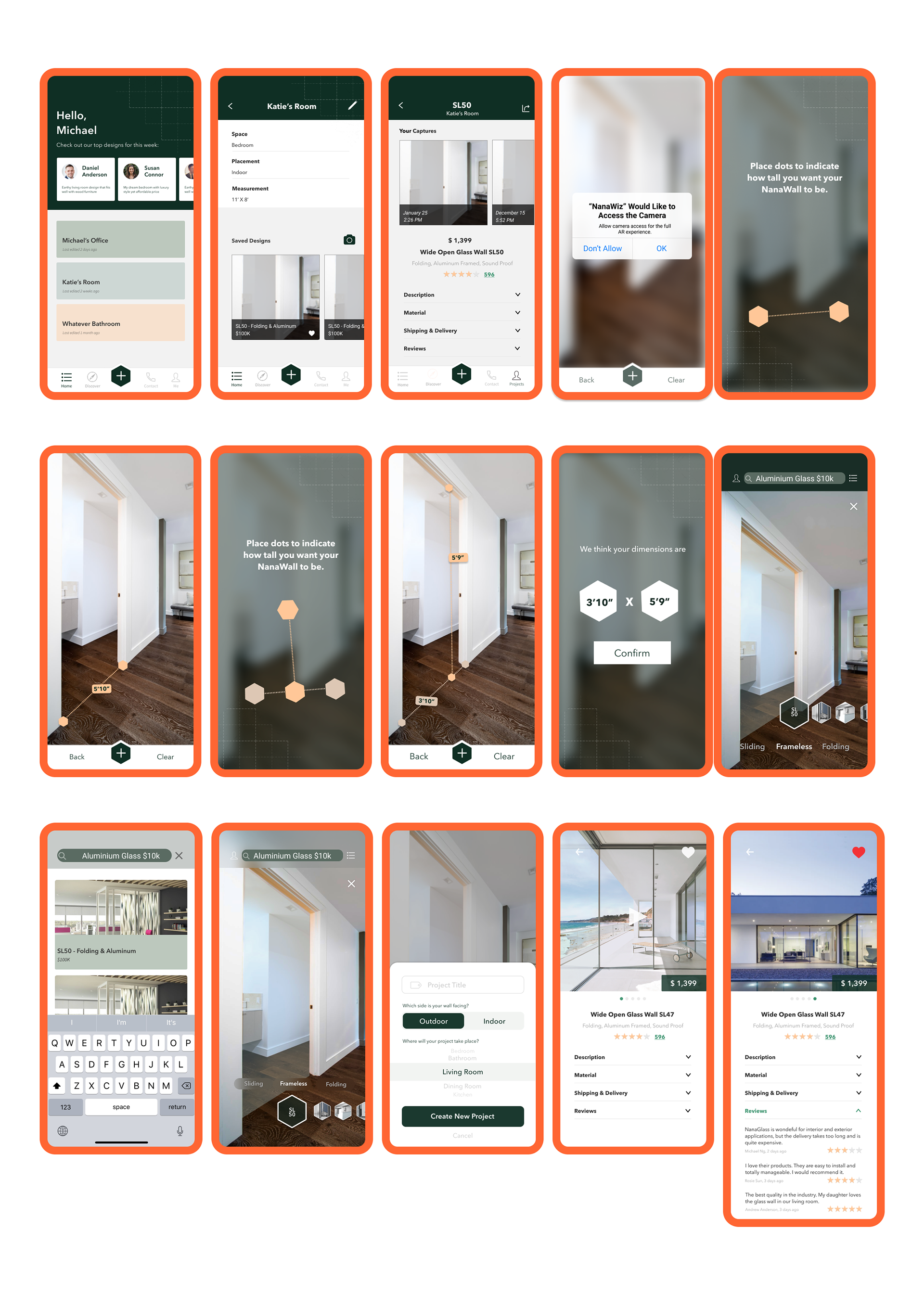
Solution
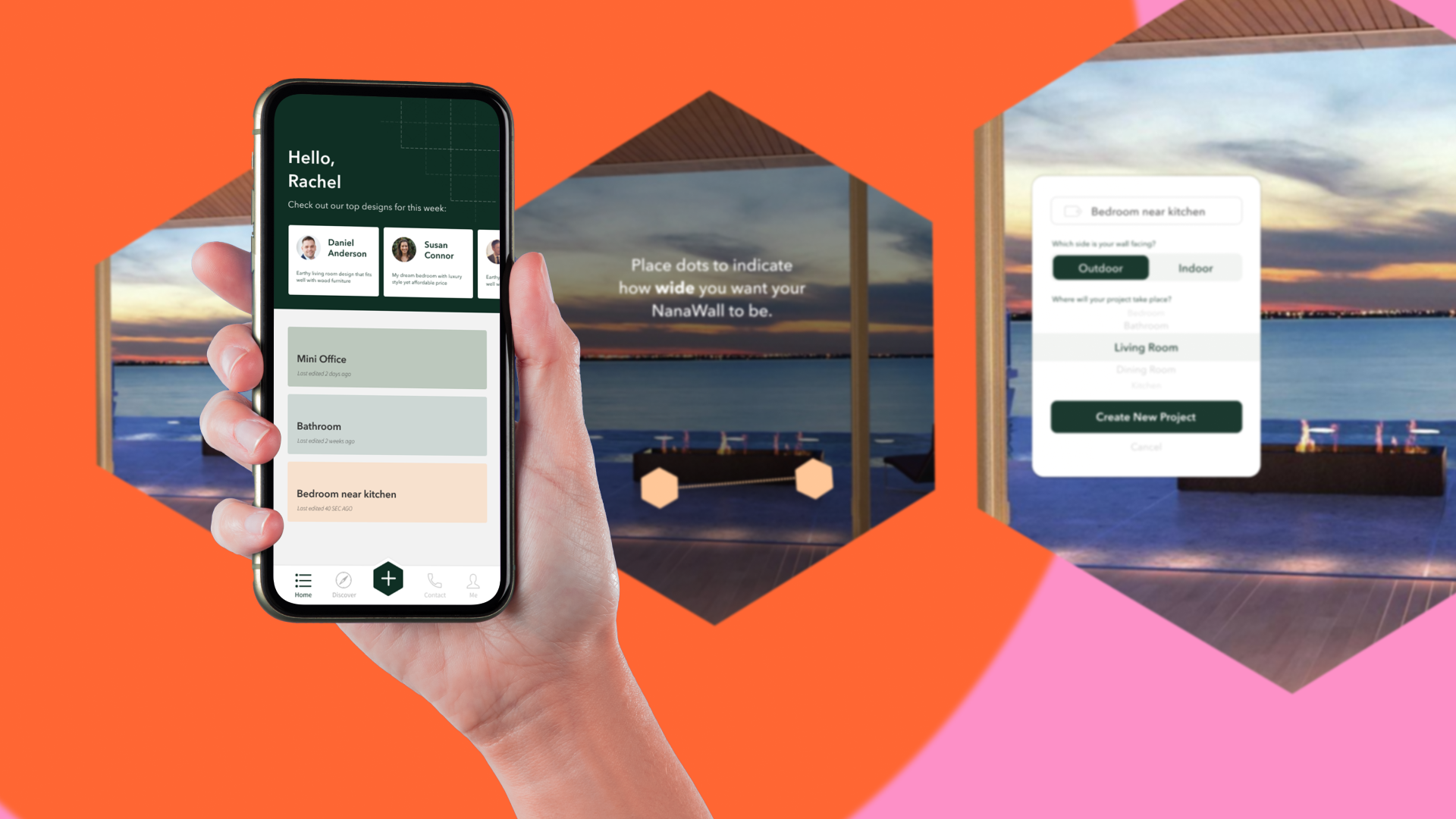
Knowing that information lag was a key cause of inefficiency we began using our understanding of the companies structure and voice we created NanAR, an AR-enabled app that serves as an information hub for residential consumers.
By enabling purchase planning, product exploration, and preference communication for residential consumers to the cooperation NanAR streamlines the residential consumers' experience with NanaWall serving to fix the imbalance in available information.
Key Features
.
Save my project
Enables customers and NanaWall representatives to come to meetings with core information about a customers project by creating shared files
After capturing different products in the AR tool, users can create a project for the space they are designing for and save the models they are interested in. The existing projects will be displayed on the homepage for quicker access.
Within each project, information including placement and measurement as well as all the captures that are stored so users can go back to this page when having conversations with Nanawall local representatives.
This feature serves as a virtual folder for users to better organize their designs.
,
.
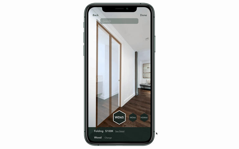
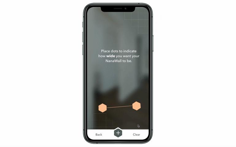
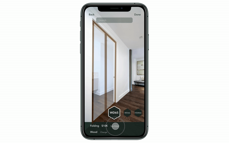
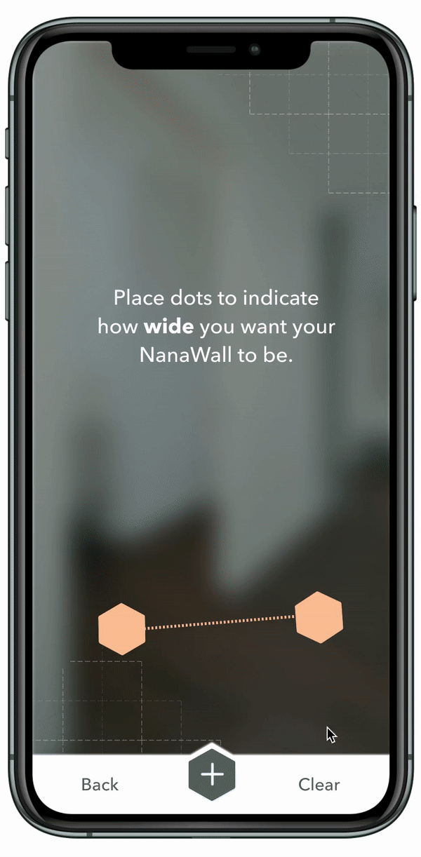
Measurement Capture & Price Calculation
Prepares customers with key pricing information before meeting with a local representative
In order to recommend the right products to users as well as to estimate the cost, we provide a feature for users to measure the width and height of their space.
This feature utilizes AR technology and as mentioned above, we’ve designed a few microinteractions to make the process intuitive and pleasant. If users believe that the measurements are not correct, they are also given the opportunity to manually enter their dimensions before the next step.
.
.
See Product Detail
Easily builds trust and knowledge about products with accessable descriptions and reviews
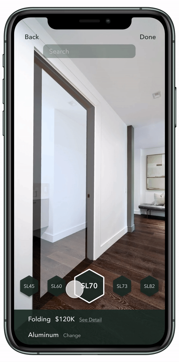
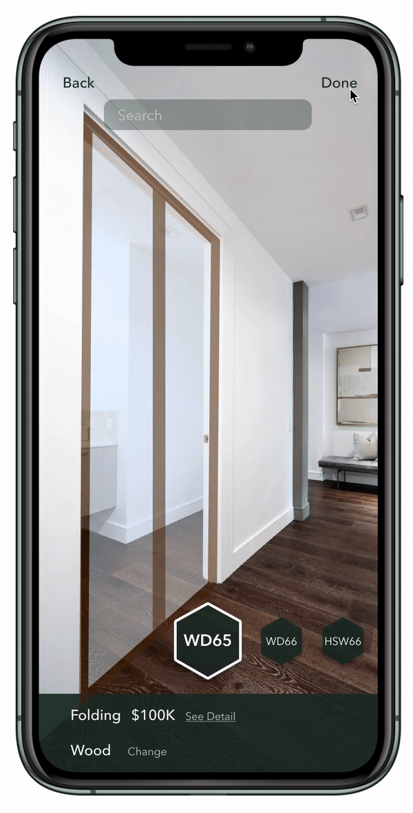
For each model displayed in the AR tool, we’ve designed a Product Detail page that offers all kinds of information including name, price, images, videos, descriptions of mechanism, materials, shipping, delivery as well as reviews from previous customers.
The ratings and reviews provided by previous customers will facilitate potential customers’ decision-making process and help them make better and more informed choices.
The Product Detail page also has a bookmark feature for users to save their favorite models so that they can consult Nanawall local representatives directly about those if needed.
.
.
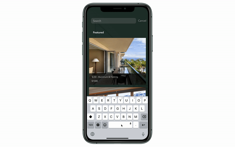
Search for Products
Quick discovery speeds consumers process
Within the AR tool, users can directly search for any model they want to try in case they have something in mind. This feature saves users time and effort as well as shows designers’ empathy for them.
.
.
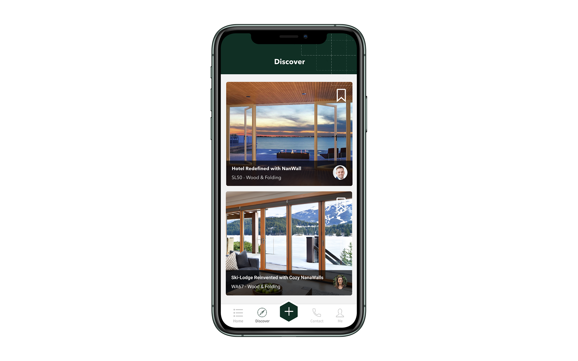
Discover
Featuring inspiration gives customers ideas
Within the app, there is a tab for people to discover other people’s designs for inspiration.
This feature helps establish a sense of community and raises the visibility of Nanawall products as well as designers/architects.
Additionally, data collected from time spent on each page provides NanaWall with invaluable customer information.
.
-
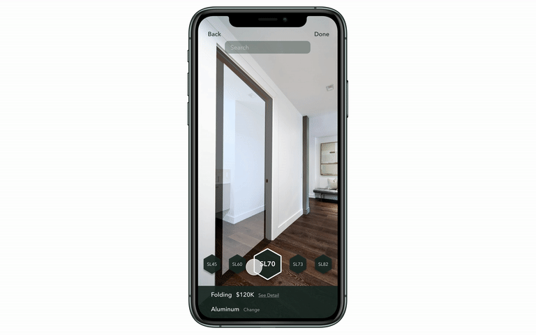
Try on Products
This AR model visualization makes models accessible everywhere
The main feature of our app is to let users try on Nanawall products with their own space and compare the effects. When users first launch the AR tool, the app will pre-select the most recommended product of the company, users can switch to any model or material that they are interested in. During the try-on process, users can take as many captures as they want from different angles, and all the captures for the same model will be grouped together and saved on the Project page.
.
.
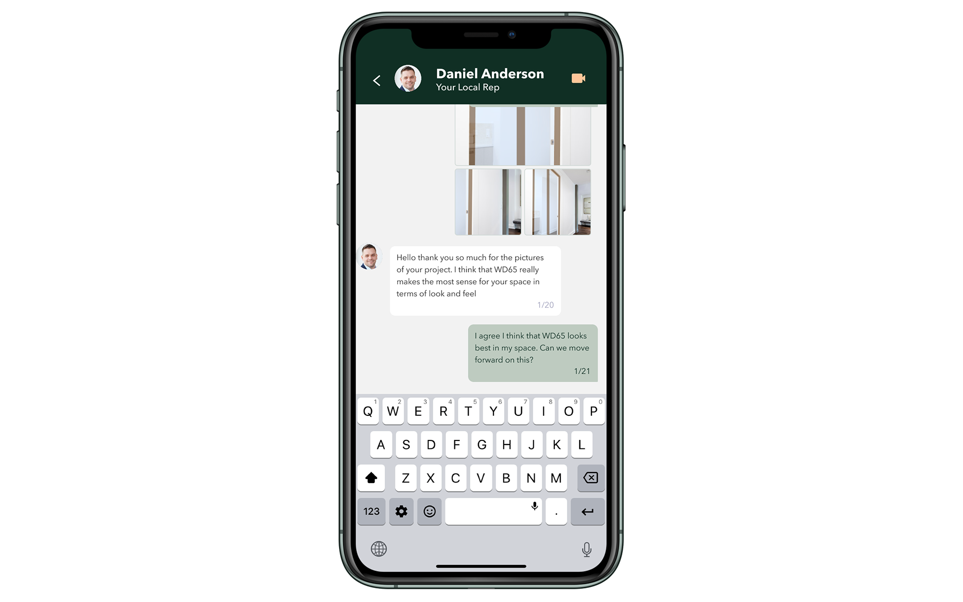
Contact
In-app communication & data-sharing enables more informed communication and more prepared responses
From the contact portion of the app, users can communicate the information that they have saved in their profile, along with written messages to their local rep, storing the data for their company, and ensuring conversations can move forward.
INTERACTIVE HIGHLIGHTS
Our solution goes beyond providing features that meet our customer's needs alleviating the pain points defined above. Thoughtful micro-interactions that provide convenience and delight along the way increase the usefulness of the solution overall.
A few stand-out interactions are detailed below.
The seamless try-on experience is enhanced by gradual transition and ever-present alteration buttons.
Adding a pause between options increases intentionality in the decision to change, mimicking the swipe, and selection buttons being next to the category of an item makes that selection obvious. Moreover, the product mechanism and price change upon full transition provide clear user feedback
Three-step AR measure (width, height, confirm) provides structure and security while reducing confusion.
We wanted users to measure width and height on separate screens to minimize their cognitive load. For each dimension, users only have to tap at the start point, drag, and release, after which a small tag will pop up indicating the exact number to provide instant feedback.
Additionally, animations simulate users using a tape by having the dashed line heading towards the endpoint. The design provides a high match between the system and the real world, guiding users subconsciously without making them think.
Finally, the confirmation provides an additional level of security.
Interactive all-in-one form reduces cognitive loadm\
To collect the necessary information without distracting users from their main flow, we embedded the form in a pop-up modal with only three fields, project name, usage, and space. Furthermore, we designed different interactions of data input including tabs and scroll bars.
With a clean layout and entertaining interactions, we make it easy for users to proceed ahead.
Impact
Residential Customers gain confidence and control over their designs with less stress.
NanAR adds value by significantly simplifying the beginning process for users who are considering using NanaWalls. Customers can have easy access to all the products provided by NanaWall as well as the detailed information of each. Given a wide range of choices, customers can try on the products and see how they fit with their space through the AR technology without driving to a different city to visit the showroom.
Furthermore, our app puts customers into the designer's seat. They can save their work in progress and better communicate their ideas to NanaWall’s local representatives through captures without the barriers of jargon. Saving them time and stress.
NanaWall employees save the time and effort of familiarizing a residential customer with NanaWall's Offerings.
From the perspective of local representatives, the app saves them time and effort of having to introduce each product to customers and go through the back and forth conversations with customers about the budget.
Now that customers who use the app will have some options in mind when approaching them, local representatives can focus more on introducing those specific models and helping customers finalize their choices.
Considering that residential customers often consume more time and result in less profit, our design aims at speeding up the process of familiarizing customers with products for local representatives.
The NanaWall corporation gains a community of users and contractors that they can better understand and target.
From the perspective of NanaWall in general, the app helps create a community to connect its customers to NanaWall employees as well as to each other. Users can view each other’s designs, get inspiration, express their own creativity, read reviews of previous customers’ purchases and make more informed decisions. The app itself serves as an advertisement for NanaWall, raising the visibility of the brand and its products. In addition, all the data collected about customer preferences through the app can be utilized by NanaWall designers to come up with better products that meet the needs of customers.