
Timeline
9 months
Tools
Adobe Photoshop, Adobe InDesign, Adobe Dimension, SolidWorks, CorelDraw, Laser cutter
As Design Chair of CMU's first dance marathon, I worked to create a brand identity that reflected the joy charitable nature of the event through posters, t-shirts, cans, Facebook ad's and much more.
Developing the Brand idea
Current State
While CMU did not have a logo Dance Marathon is a nationwide organization. Thousands of dance marathons have been held and thousands of dance marathon logos have been made. However, in my opinion, the current solutions are lacking. Currently, most dance marathon logos are busy unprofessional or lack cohesion with the event.
I wanted more for the CMU logo and design materials, I set out to do that through thoughtful design.
,


Concept
Dance Marathon is an event that supports charity and has a lot of physical activity. For the logo I wanted to incorporate this joy and the literal action of dancing. I also knew that I had to include the miracle network flame, to represent the organization that is being supported by this event.
The colors of the logo come from the colors of dance miracle network. Although, many schools choose to use school colors instead, CMU's true school color is tartan, (a pattern, which is just too visually complicated) and the de-facto uniform colors of red and black did not encompass the hope inspired by the yellow of dance marathon and the CMU logo.
Iterations
Insights
Creating this logo, the main first problem I came to was that it was difficult to make what I drew exactly visually match the shapes of the text they were apart of because the chosen font is so structurally free flowing. I realized I could fix this problem by, instead of drawing and mapping out the objects I was adding freehand, but by creating them through puppeting variations of the chosen font so that all of the objects have the same feel. This technique is used in all subsequent materials.
Subsequent Implementation
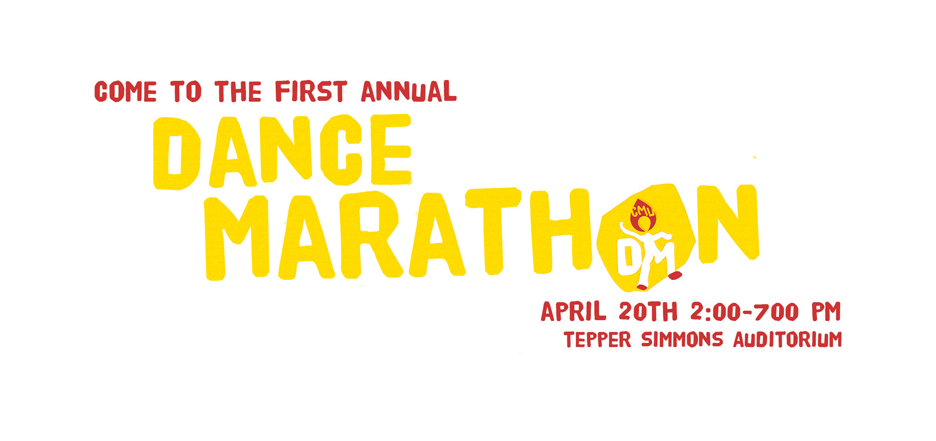
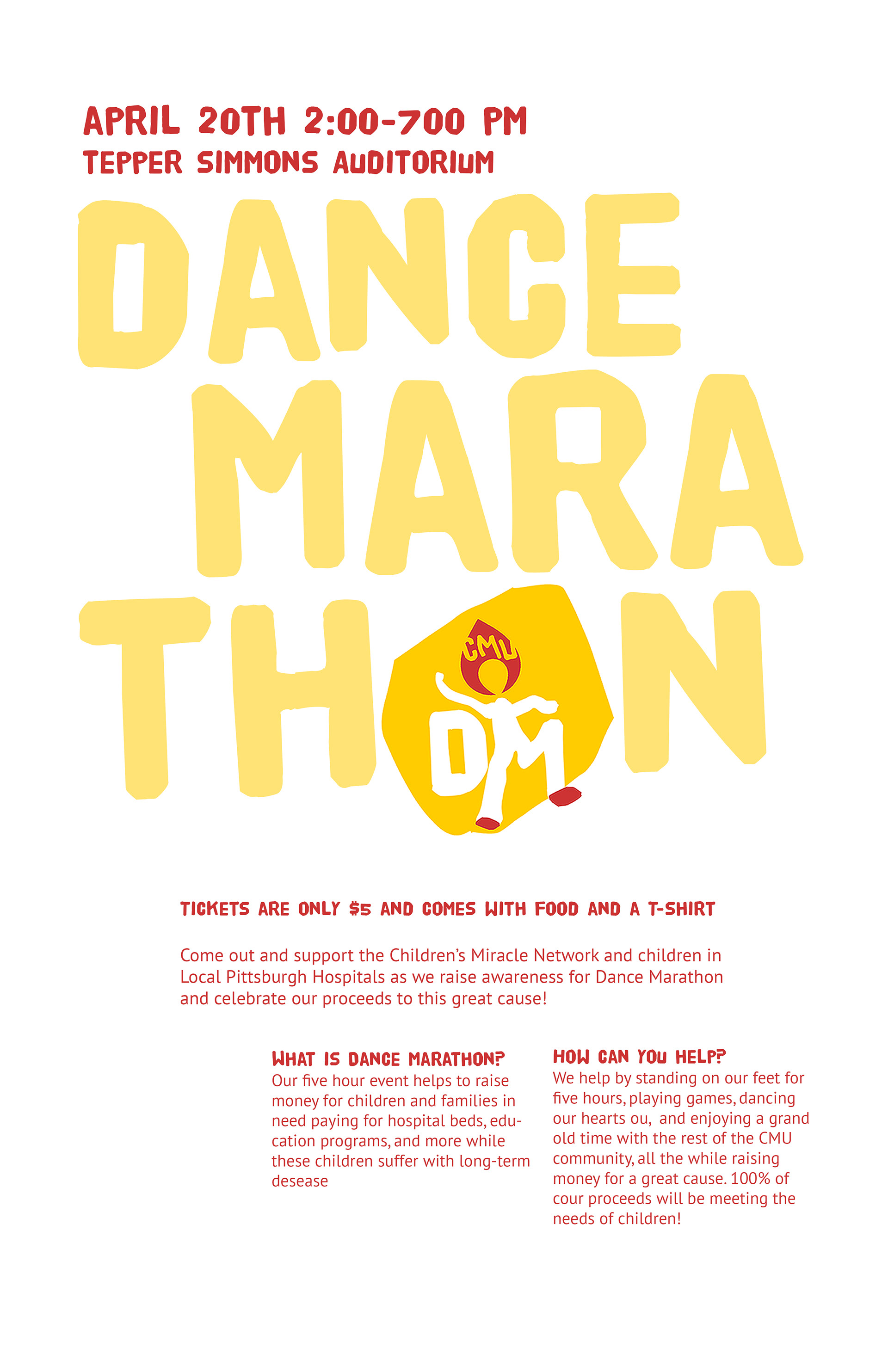
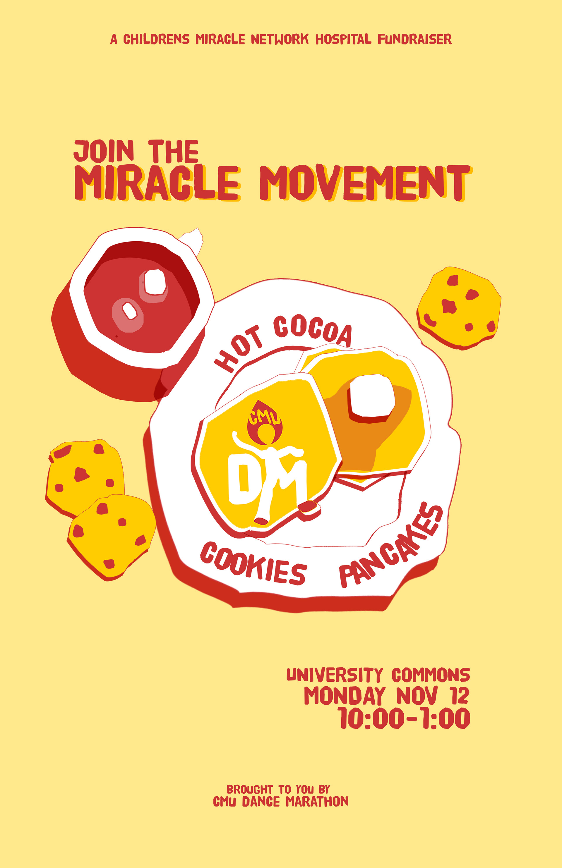
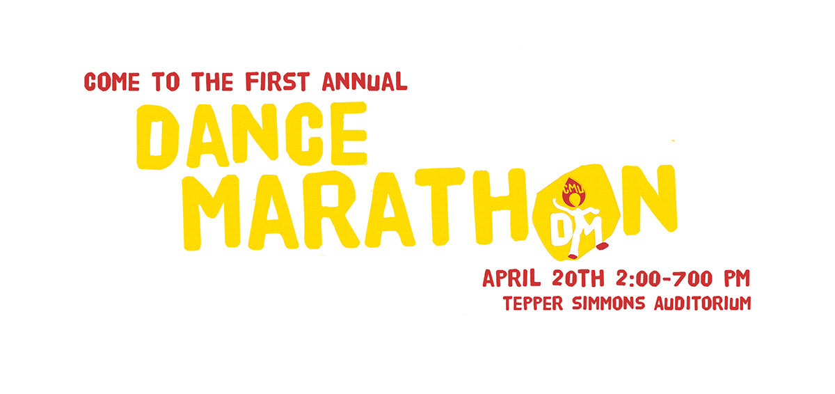
Fundraiser Poster #1
To create fundraising posters for dance marathon. I first went through a process of figuring out the hierarchy of information and then gradually adding different design elements to emphasize the important points. I then translated this information into a black & white version of the poster. Before, finally, adding in the design elements essential to the CMU Dance Marathon brand such as colors fonts and shapes.
.


Fundraiser Poster #2
To create this poster I relied on the hierarchy established for the prior fundraiser, and altered it to fit the new items on sale and the lack of preorders. I continued in this poster the use of the logo as an object, using it as a pancake in this case.
.
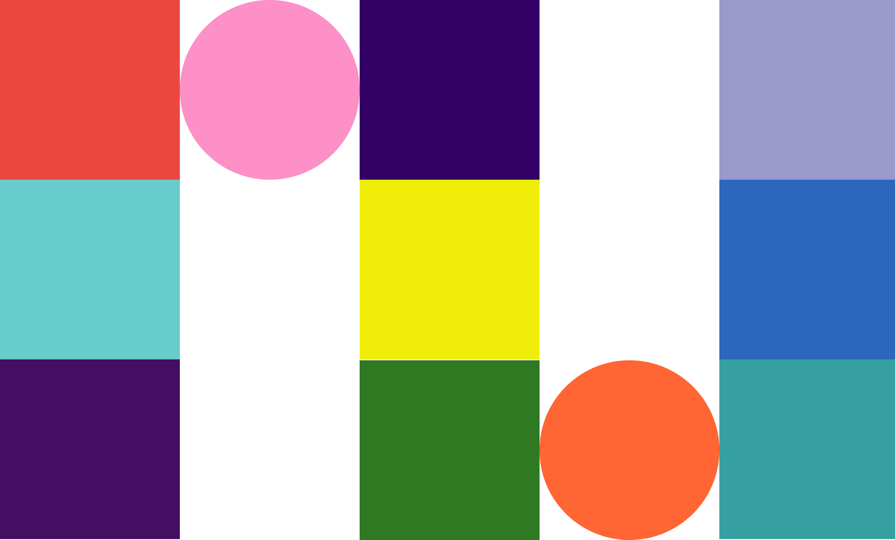
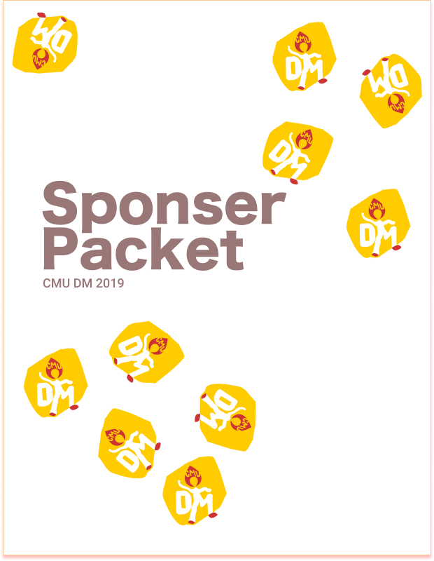
Sponsorship Packet
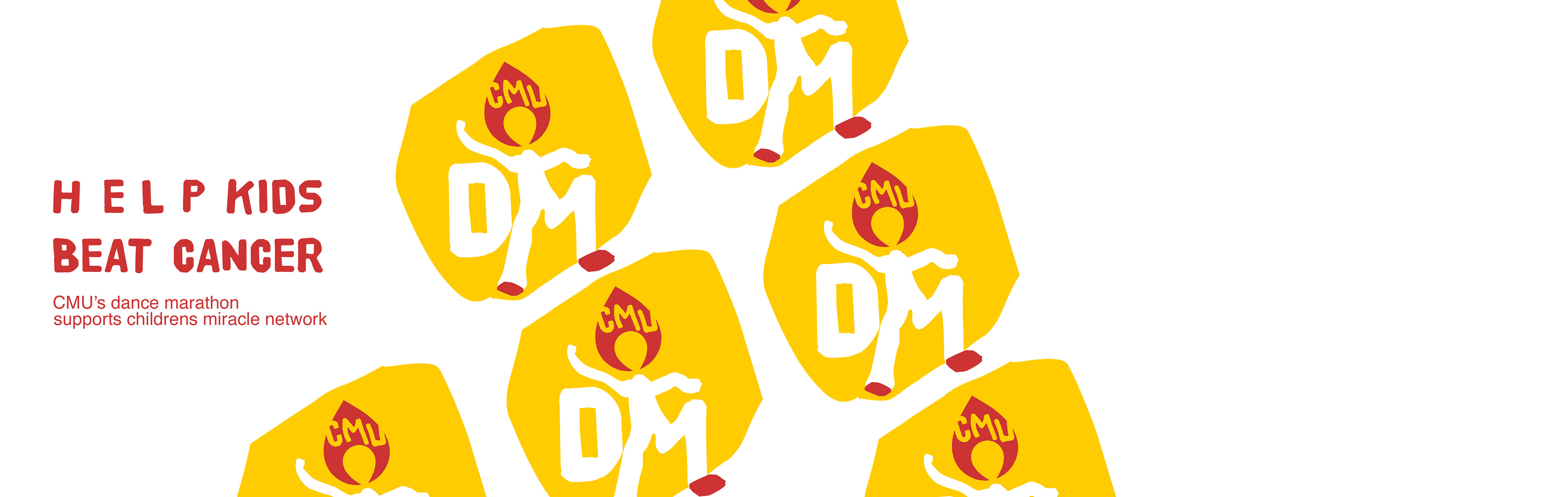
The sponsorship packet needed to look professional yet carry the youthful energy of our mission. While most sponsorship packets rely on pictures from past events, given this is our inaugural year, I did not have that luxury. For the cover, inspired by Dadaism, I decided to strew miniature versions of the logo across the page for the happy messiness reminded me of youth, the repetition of the logo, served as an identifier, their randomness allowed for the title to look more purposeful, and their presence did not eradicate the professional minimalism I was trying to achieve.
,
.

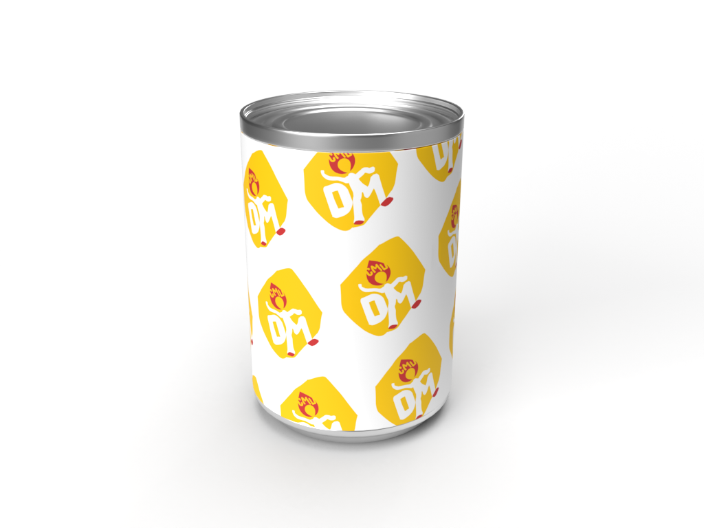
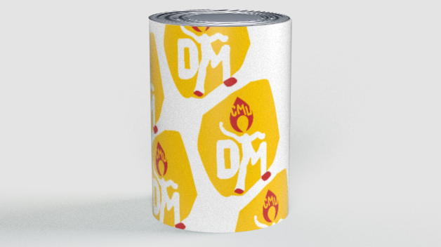
Canning Fundraiser Sleeve
This is the cover of a can used for canning events. The strong statement was used to entice people to come over. The repetition of the logo, was used as a design element. the extra paper at the end was used for ease of application.
.
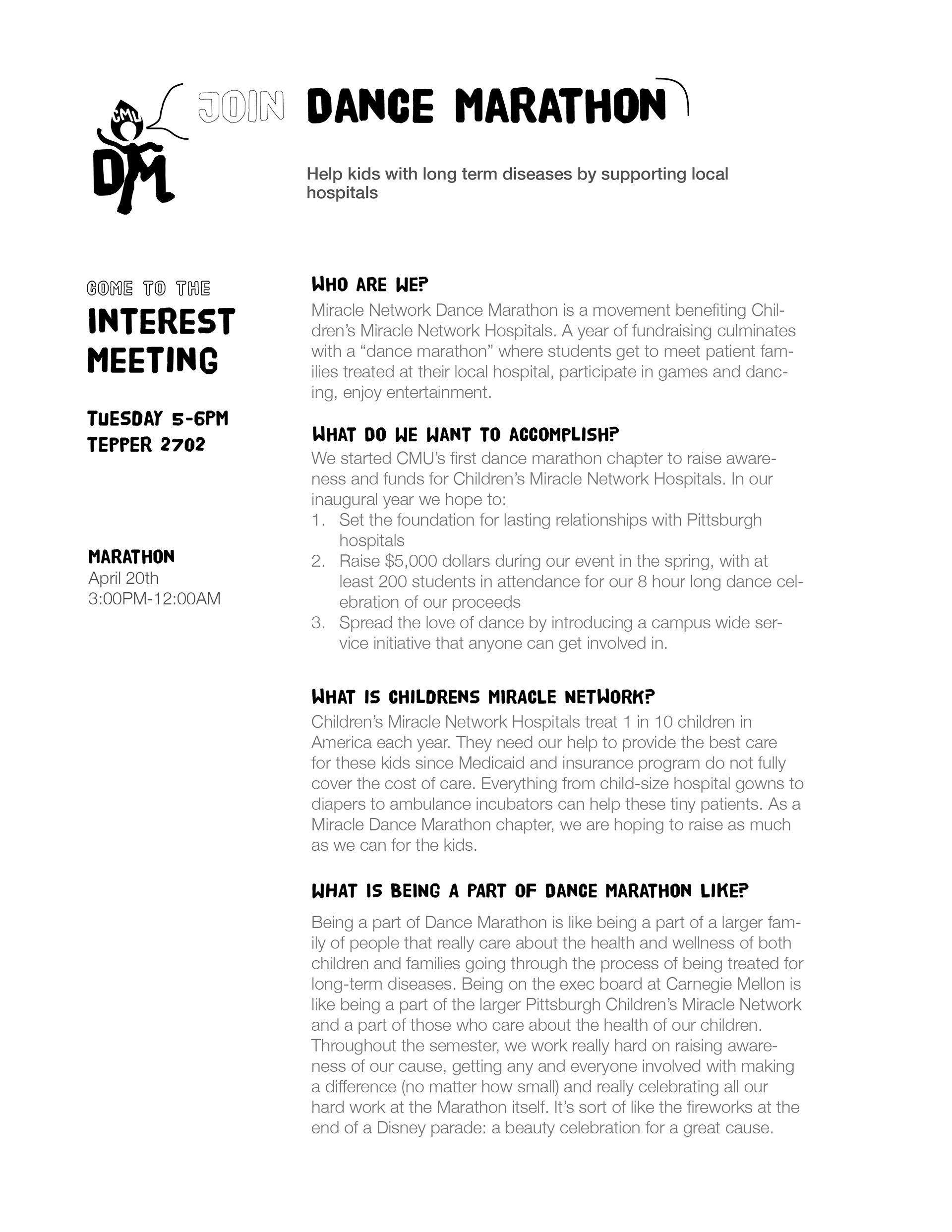
Activity Fair Flyers & Station
The activity fair was a really important event this year as much of our organization is seniors. Two parts were needed to prepare for the activities fair: the poster board and the flyers.
The flyer was designed with information hierarchy at the forefront. I looked up other flyers and then sent the exec board questions to fill out, all of which were designed to establish the value of the club to a potential member. I wanted to put emphasis on the interest meeting as attendance there was the next most important step in retaining members.
.
.
The poster was designed to be simple and eye-catching, while giving examples for presenters to point to during the fair. I wanted dance marathon to stand out. So I laser cut the letters using the same font as used throughout the brand, as the cut out letters would physically stand out and look professional. The rest of the phrase was hidden into a grid pattern as from far away I wanted it to serve as more of a visual element as activity fair patrons would not be reading the whole thing anyway.
The implementation of these materials led to an exponential increase in sign ups for the club with around fifty new members signing up, which more than doubled the size of the organization.
.
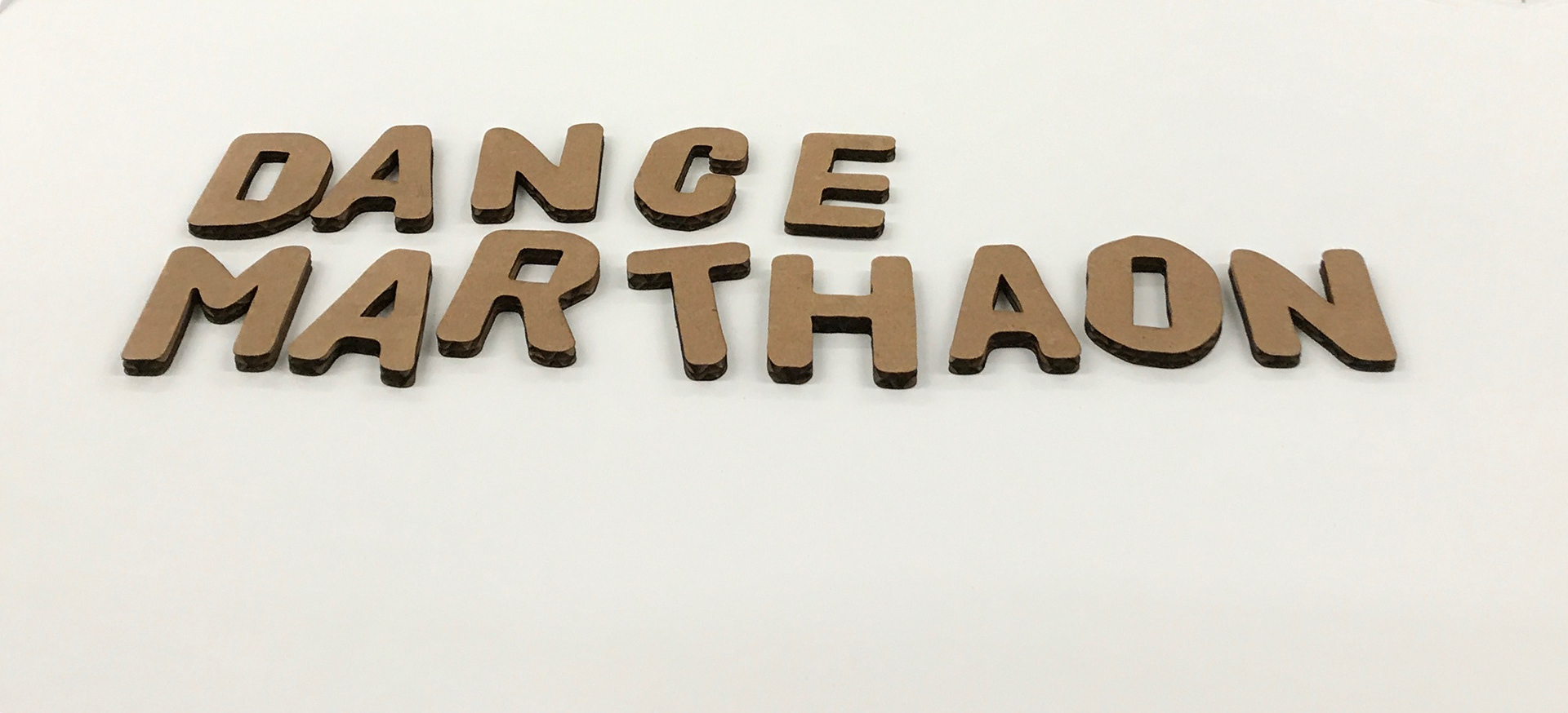

I custom laser cut letters used to pop out of the board
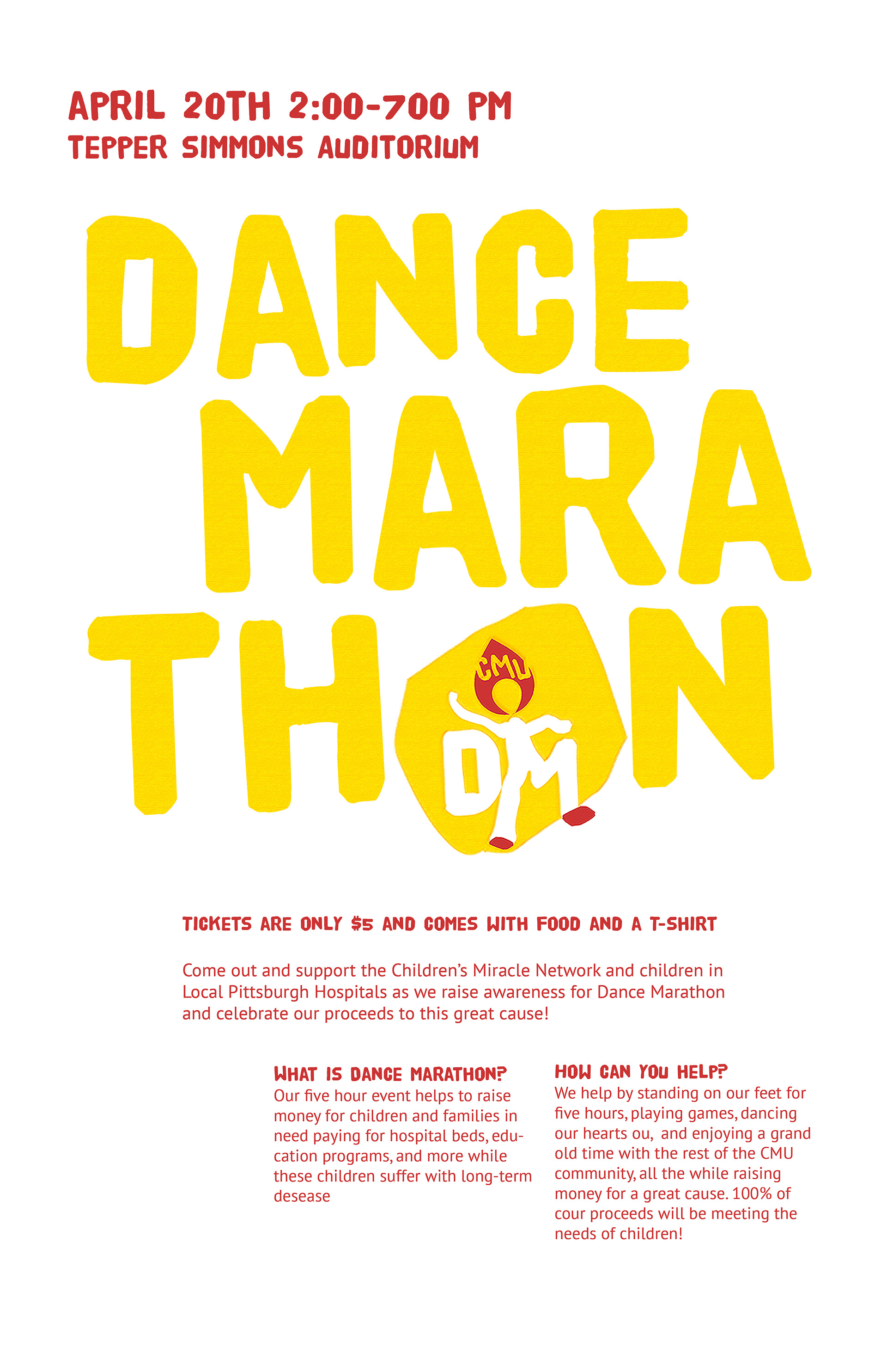
Main Event Poster & Banner
For the marketing for the final event. I wanted to keep the poster simple and legible. Once I had organized the text I realized that it was quite boring to look at. I realized that the title would be the place to add visual interest. Initially I tried changing the opacity of the letters, however this made the space look far too empty. To add visual interest, while maintaining a consistent feel I decided to texturized the yellow on the poster to give the effect of layers of ink having been used to create it. While I had not added texture in the past, I believe that the minimalism in applying it maintains the happy childish but professional identity of the organization as it makes the lines softer. The same style was applied to the matching Facebook cover photo.
.
Lessons Learned
Working with dance marathon offered me an incredible opportunity to see my designs have an impact on others. I became acutely aware of the importance of planning and structure in design and the effect all of those components have on a brand. Working on dance marathon was really hard as it was the first time I had to worry about ensuring proper organizational implementation of designs from afar and not doing so in a well-organized environment. These activities helped me better articulate the value and importance of design to an organization and taught me to lead effectively over the barriers of bureaucracy..
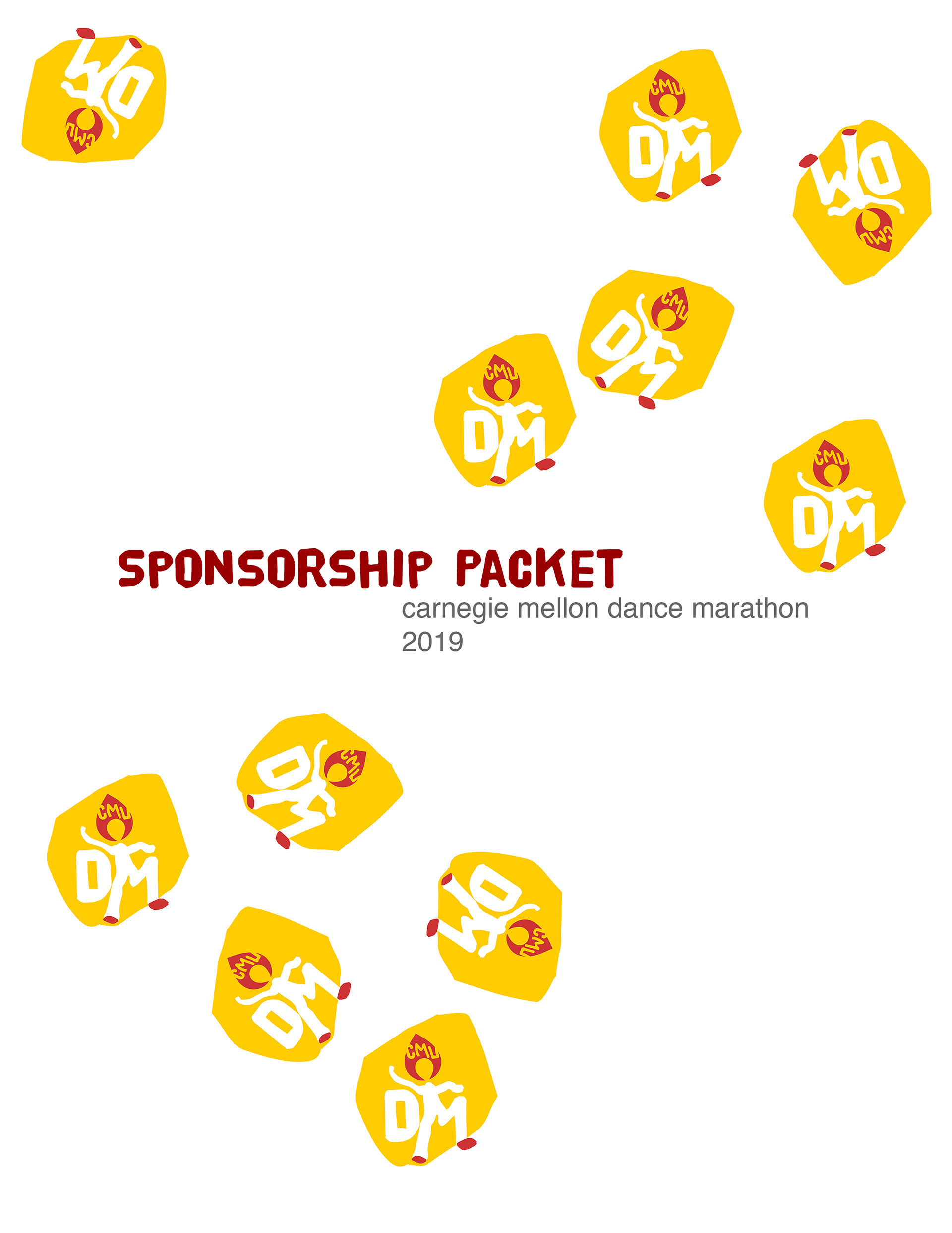
sponsorship packet cover

fundraiser poster
Exec Shirt