
An information hub for NanaWall
3 Weeks
The purpose of this project was to strategically analyze the NanaWall cooperation with the goal of creating a native app that supports their service, adding real value for the cooperation financially in the long run.
Through competitive market analysis, stakeholder mapping, and an interview with a NanaWall sales rep we found that the key inefficiencies in NanaWall's service all come from poor communication from NanaWall about products to consumers and poor communication of consumers preferences to NanaWall.
Currently, residential customers of NanaWall take up 50% of employees' time, but a much smaller percentage of their profits. The root cause of this inefficiency is that information about NanaWall's pricing and features is not easily accessible. One must call a local rep to figure out prices and travel for hours to visualize what one would look like in their own home.
Moreover, since information is all transferred via phone call NanaWall cannot collect data on users' preferences in real-time to make predictions.
Knowing that information lag was a key cause of inefficiency we began using our understanding of the companies structure and voice we created NanAR, an AR-enabled app that serves as an information hub for residential consumers. By enabling purchase planning, product exploration, and preference communication for residential consumers to the cooperation NanAR streamlines the residential consumers' experience with NanaWall serving to fix the imbalance in available information.
Team
Celine Chang
Michael Silvestre
Danielle Shoshani
Roxanne Zhang
My Role
Design — I collaborated to develop a smooth try-on experience focusing on balancing efficiency and delight. This was one of the first projects where I had enough iteration time to push into developing thoughtful microinteractions and see the benefits of those actions.
I developed a data hierarchy to ensure that user data was transformed through the system in an understandable manner.
Additionally, I pushed for search features to be integrated into the app, tying the product better to its need.
Research — I led and initiated company interviews, enabling our group to develop a user needs-based solution instead of an assumptions-based solution.
Teamwork — I successfully introduced a process to assist group dynamics, increasing overall idea contribution and supporting the team’s process.
Purpose
This project was an assignment from Interaction Design Studio II, where we were expected to analyze a company and develop a solution that would improve their service. In short, we would be answering the question:
How can technology be used to improve NanWall’s service?
Who is NanaWall?
NanaWall is a company that makes bi-folding glass doors, Actually, they are the company, our competitive analysis research found that NanaWall was ahead of its competitors in terms of its product development. Winning many awards.
Their voice as a company can be described as: innovative but not eccentric, cutting edge but not flashy, luxurious but practical
However just because the company is innovative in the bi-folding glass door space, does not mean they are in all way’s revolutionary through research in the discovery phase we were able to identify clear holes in their service.
.
...
Discovery Phase
APPROACH
Our group began this project with no knowledge on the subject of NanaWall or their service. To build an understanding of their service to pinpoint an appropriate solution we did the following:
Competitive Analysis - Understanding NanaWall and their competitors to know where NanaWall had relative room for improvement and where their strengths were.
Voice Analysis - Lifting and expressing NanaWall's Company Voice to ensure that any solutions developed would be on-brand.
Stakeholder Diagramming - Diagramming the company and all related entities and the information and value that flows through them to know where intervention could be helpful and where stresses are.
Contextual Interviews with NanaWall Employees - Interviewing NanWall employees to gauge an insider understanding of the process from an inside POV.
Finally, at the end of this stage, we used Reverse Assumptions (my favorite method) to nail down our solution definition.
Findings
In completing these methods, we came up with four key findings built on insights and evidence that shaped our Final Project.
Lack of transparency makes residential consumer interactions frustrating and unprofitable.
Prices, models, and installation are not available on the NanaWall website, so all customers must learn this critical information from conversations with local representatives.
For commercial contractors who purchase large quantities of NanaWall’s the cost vs labor, balance is reasonable. On the other hand, since residential consumers usually only buy one NanaWall in their lifetime, residential customers' purchases take up a disproportionate amount of labor.
"Residential consumers make up less than 50% of profits, but they take up over 50% of my time"
NanaWall Local Representative on the burden of being the sole explainer.
Poor Accessibility of Models Burduns Consumers
NanaWall showrooms are often difficult for customers to visit without extensive travel (4+ hrs), making it hard for them to visualize what the product would look like in their space.
"Going to a showroom is a trip for most people. Because it’s such a large purchase, I try to find NanaWalls in the wild to show them, but I rarely find the exact model they’re looking for."
NanaWall Local Representative
.

NanaWall showroom locations are far apart, making seeing a given model of NanaWall in person difficult.
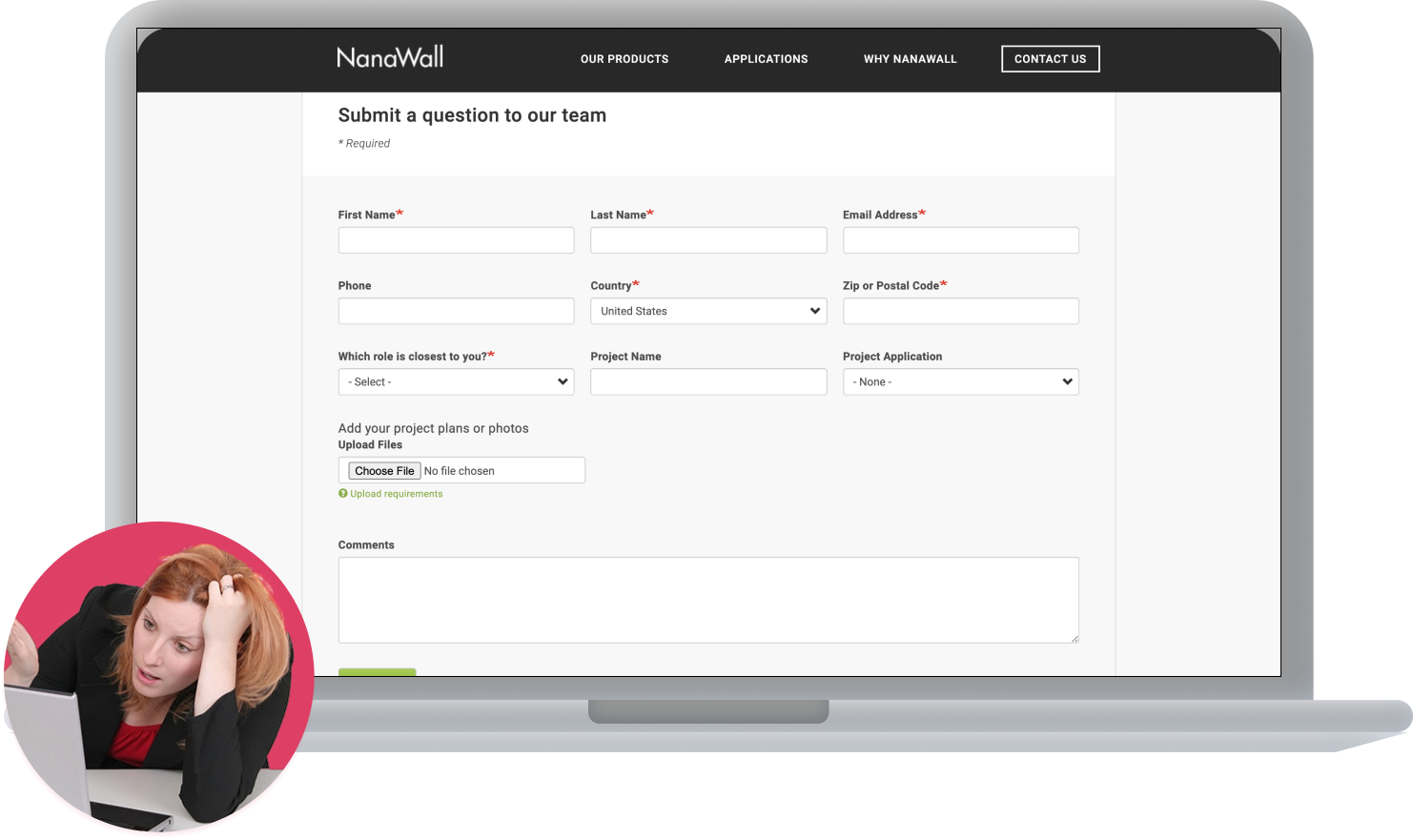
Excessive forms before contacting a local representative discourage purchasing
In order to contact a local representative, the key to all information for a residential consumer, one must enter a series of forms on the NanaWall website.
Putting this point of contact behind levels of barriers makes it more difficult to make the conversion between interest and purchase.
,,,
Low Predictive Information makes informed production choices unattainable
There is no real source for NanaWall to use to track the decision process as it is all done over the phone between the local rep and the resident.
As you can see from this stakeholder diagram, residents (residential consumers) and designers at NanaWall are not connected to each other, highlighting the lack of information transfer between these groups.
,
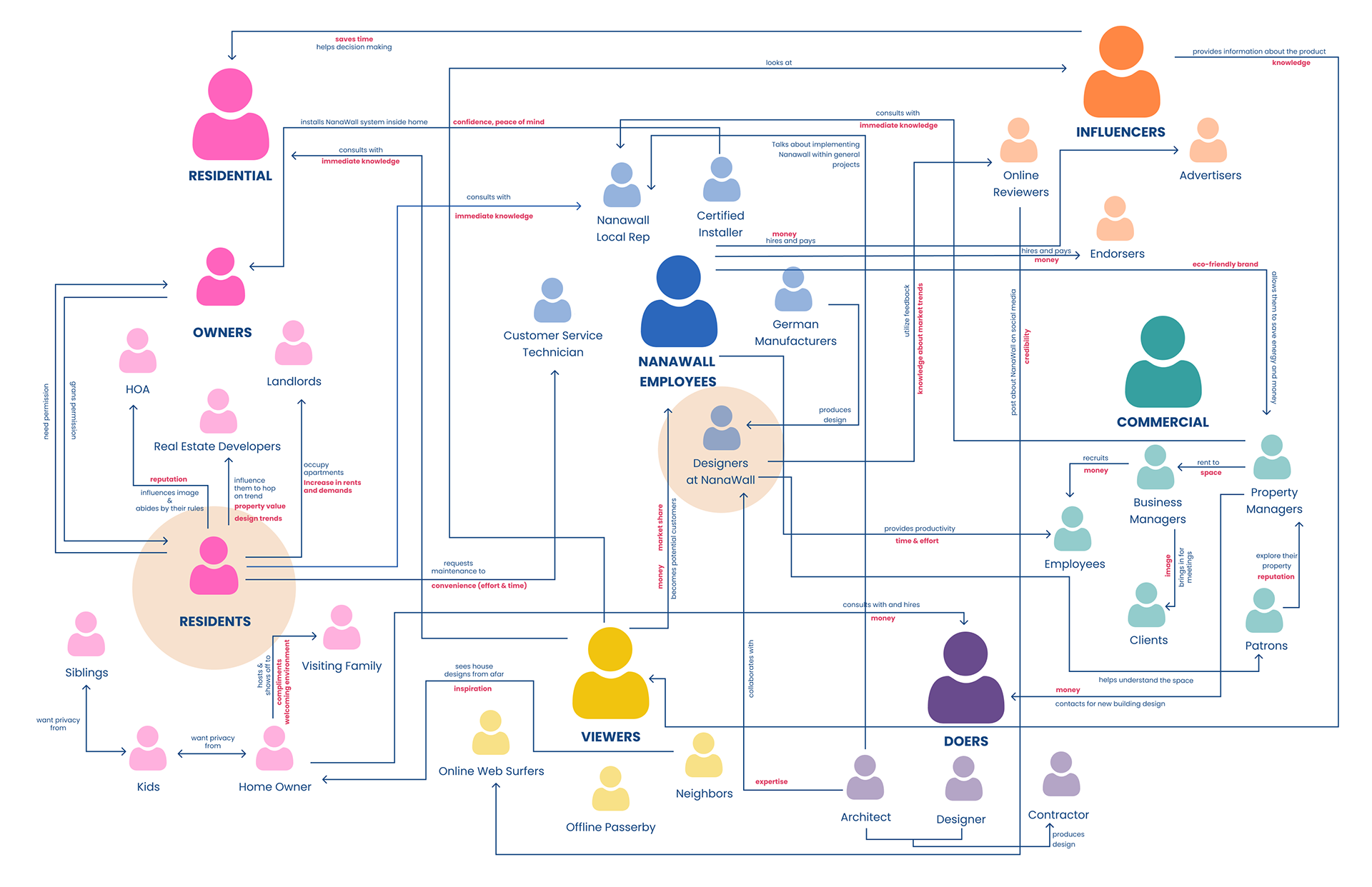
Stakeholder Diagram - NanaWall Residential Consumer
findings summary
NanaWall may make glass walls, but it's a lack of transparency that blocks them from improvement.
With these four findings in mind, we explored the solution space focusing on the concept of transparency. We needed to increase the transparency of information from NanaWall and residential consumers, in order to increase company profitability, consumer experience. All while keeping the experience delightful and in line with the company's image.
Solution Overview
NanAR is an AR-enabled app that serves as an information hub for residential consumers. NanAR streamlines the residential consumers' experience with NanaWall serving to fix the imbalance in available information.
By enabling purchase planning, product exploration, and preference communication from residential consumers to the cooperation NanAR improves the NanaWall service from every angle.
NanAR is an AR-enabled app that serves as an information hub for residential consumers.
By enabling purchase planning, product exploration, and preference communication for residential consumers to the cooperation NanAR streamlines the residential consumers' experience with NanaWall serving to fix the imbalance in available information and the lack of profitability that follows.
Built on the goal of increasing transparency and creating a delightful experience aligned with the NanaWall brand, this app strategically conveys information in a way that benefits all parties involved.
Clear product descriptions, simplified discovery pages, and easy searches make information accessible to Residential Consumers.
.
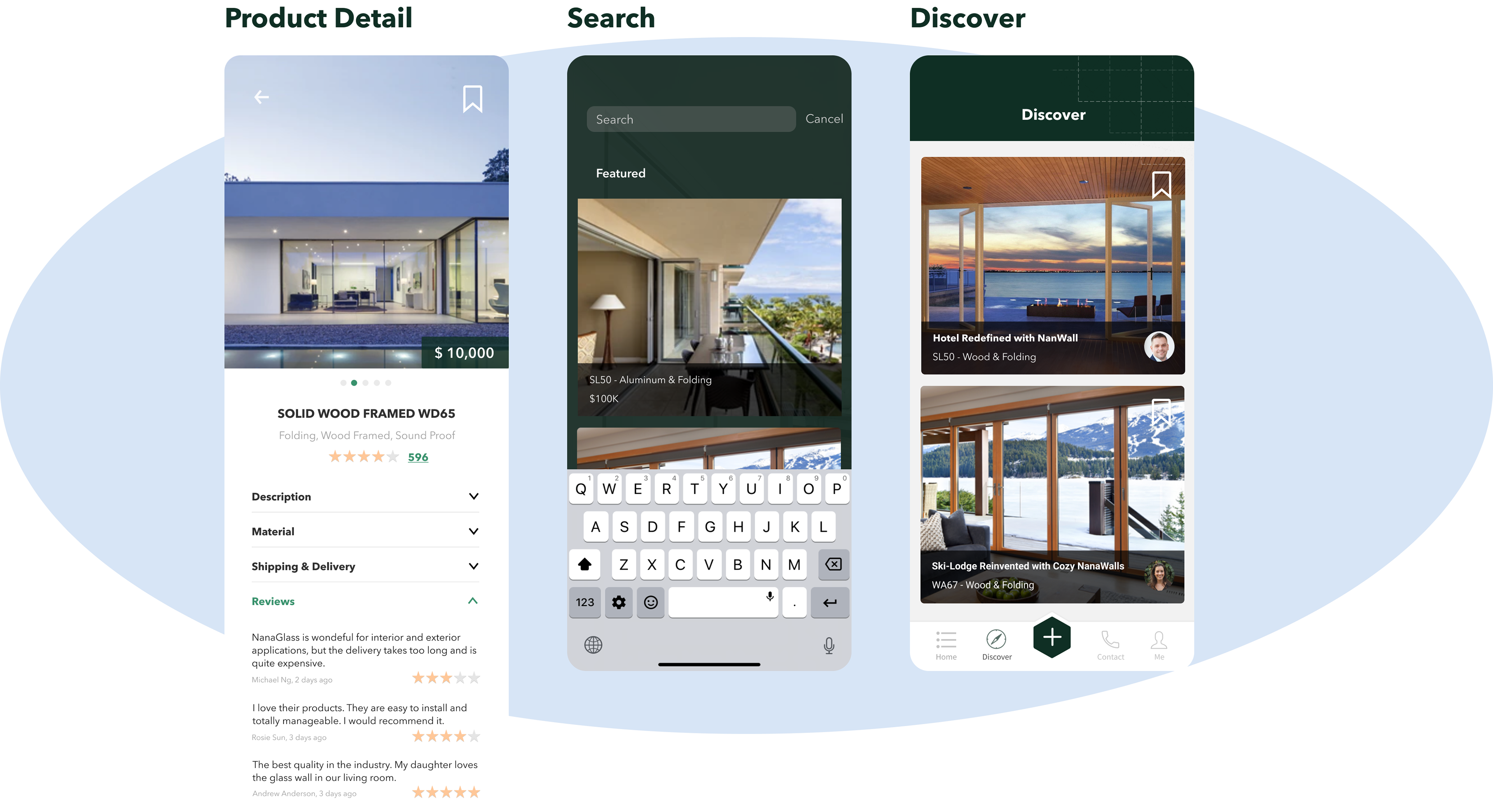
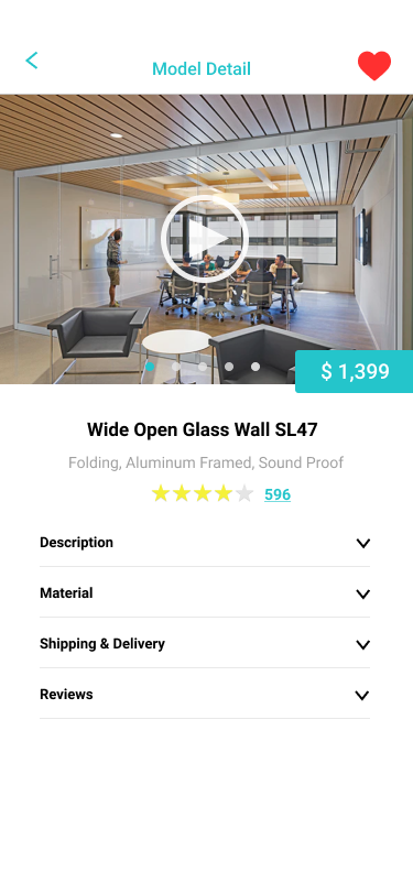
See Product Detail
For each model displayed in the AR tool, we’ve designed a Product Detail page that offers all kinds of information including name, price, images, videos, descriptions of mechanism, materials, shipping, delivery as well as reviews from previous customers.
The ratings and reviews provided by previous customers will facilitate potential customers’ decision-making process and help them make better and more informed choices.
The Product Detail page also has a bookmark feature for users to save their favorite models so that they can consult Nanawall local representatives directly about those if needed.
Search for Products
Within the AR tool, users can directly search for any model they want to try in case they have something in mind. This feature saves users time and effort as well as shows designers’ empathy for them.
Discover
Within the app, there is a tab for people to discover other people’s designs for inspiration.
This feature would help establish a sense of community and raise the visibility of Nanawall products as well as designers/architects. On the homepage, we’ve shown a section that recommends the top designs of the week to users and those contents are extracted from the Discover page.
Information capture and project pages allow residential consumers to adequately prepare for meetings with local reps
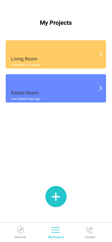
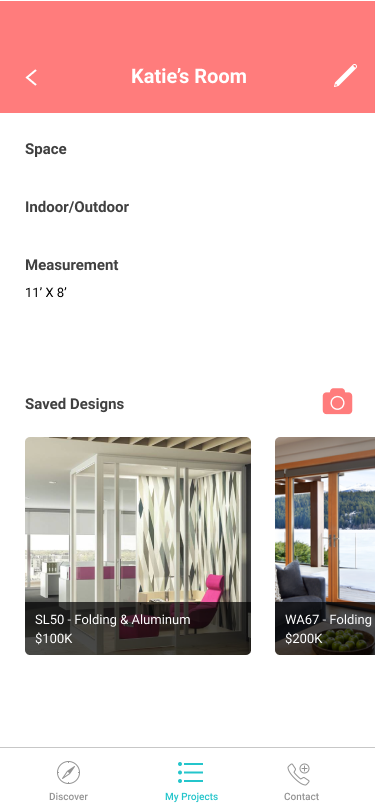
Save my project
After capturing different products in the AR tool, users can create a project for the space they are designing for and save the models they are interested in. The existing projects will be displayed on the homepage for quicker access. Within each project, information including space, placement and measurement as well as all the captures are stored so that users can go back to this page when having conversations with Nanawall local representatives. This feature serves as a virtual folder for users to better organize their designs.
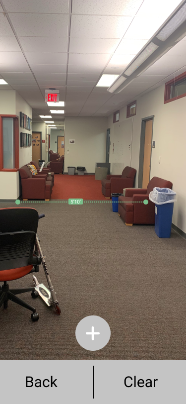
Measurement Capture & Price Calculation
In order to recommend the right products to users as well as to estimate the cost, we provide a feature for users to measure the width and height of their space.
This feature utilizes AR technology and as mentioned above, we’ve designed a few microinteractions to make the process intuitive and pleasant. If users believe that the measurements are not correct, they are also given the opportunity to manually enter their dimensions before the next step.
AR model visualization makes models accessible everywhere
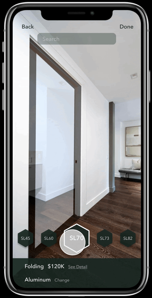
Try on Products
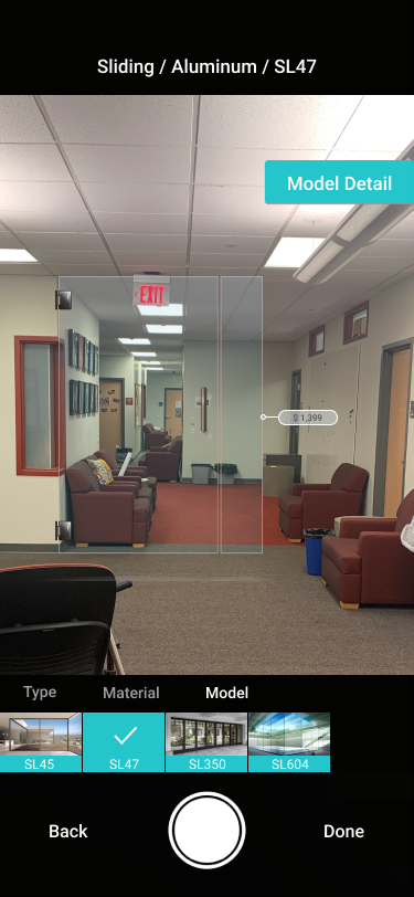
The main feature of our app is to let users try on Nanawall products with their own space and compare the effects. When users first launch the AR tool, the app will pre-select the most recommended product of the company, users can switch to any model or material that they are interested in. During the try-on process, users can take as many captures as they want from different angles, and all the captures for the same model will be grouped together and saved on the Project page.
Simplified strategic information collection makes the local rep contact process instantanious
Saved projects and In-App Communication give NanaWall better data to collect user preferences.
Feature Review
Save my project
After capturing different products in the AR tool, users can create a project for the space they are designing for and save the models they are interested in. The existing projects will be displayed on the homepage for quicker access. Within each project, information including space, placement and measurement as well as all the captures are stored so that users can go back to this page when having conversations with Nanawall local representatives. This feature serves as a virtual folder for users to better organize their designs.
Contact
Users should be able to contact their Nanawall local representatives directly through the app. Our app collects users’ location information and based on their locations and interests, our app will automatically figure out who would be the best person for each user to contact.
The detailed information such as name, phone number, and email address would be provided within the Contact tab.
With just one touch, users can be connected with the right person and this saves their time and effort of searching for information on the website.
Measure Dimensions
In order to recommend the right products to users as well as to estimate the cost, we provide a feature for users to measure the width and height of their space.
This feature utilizes AR technology and as mentioned above, we’ve designed a few microinteractions to make the process intuitive and pleasant. If users believe that the measurements are not correct, they are also given the opportunity to manually enter their dimensions before the next step.
Try on Products
The main feature of our app is to let users try on Nanawall products with their own space and compare the effects. When users first launch the AR tool, the app will pre-select the most recommended product of the company, users can switch to any model or material that they are interested in. During the try-on process, users can take as many captures as they want from different angles, and all the captures for the same model will be grouped together and saved on the Project page.
How it works
Try-On
Contact
Project Profiles
Discover
Me
Discovery pages enable better product understanding
In-app measurements and calculations make pricing transparent to residential customers.
In-app contacting makes all information centralized
In-app actions provide instant and aggregatable feedback to
Easy project exploration.
Allow the uses to play with options and become familiar with NanaWall nomenclature
Show the customer a NanaWall in their space
Allow customers to view NanaWall costs and constraints before local rep contact.
Enable consumers to easily contact their local rep.
Allow local reps to view consumers' spaces and choices they have entered in the app.
Residential Customers gain confidence and control over their designs with less stress.
NanAR adds value by significantly simplifying the beginning process for users who are considering using NanaWalls. Customers can have easy access to all the products provided by NanaWall as well as the detailed information of each. Given a wide range of choices, customers can try on the products and see how they fit with their space through the AR technology without driving to a different city to visit the showroom.
Furthermore, our app puts customers into the designer's seat. They can save their work in progress and better communicate their ideas to NanaWall’s local representatives through captures without the barriers of jargon. Saving them time and stress.
NanaWall Employees save the time and effort of familiarizing a residential customer with NanaWall's Offerings.
From the perspective of local representatives, the app saves them time and effort of having to introduce each product to customers and go through the back and forth conversations with customers about the budget.
Now that customers who use the app will have some options in mind when approaching them, local representatives can focus more on introducing those specific models and helping customers finalize their choices.
Considering that residential customers often consume more time and result in less profit, our design aims at speeding up the process of familiarizing customers with products for local representatives.
The corporation gains a a community of users and contractors that they can learn from and market to.
From the perspective of NanaWall in general, the app helps create a community to connect its customers to NanaWall employees as well as to each other. Users can view each other’s designs, get inspiration, express their own creativity, read reviews of previous customers’ purchases and make more informed decisions. The app itself serves as an advertisement for NanaWall, raising the visibility of the brand and its products. In addition, all the data collected about customer preferences through the app can be utilized by NanaWall designers to come up with better products that meet the needs of customers.
Solution Needs
In order to be effective, the NativeApp should do the following 5 things.
Allow the uses to play with options and become familiar with NanaWall nomenclature
Show the customer a NanaWall in their space
Allow customers to view NanaWall costs and constaints before local rep contact.
Enable consumers to easily contact their local rep.
Allow local reps to view consumers' spaces and choices they have entered in the app.
Iteration 1/4
Setting Group Norms & Visualizing a solution
Introducing Parallel Design
Now that we are defined what needed to be inside our app we need to figure out what the flow would be. We initially were struggling to come to a clear agreed-upon consensus.
I noticed that our group has a tendency to let some individuals have more say than others and I knew that we tend to overestimate the amount others agree with us, so I asked and advocated for a parallel processing solution to be implemented based on my knowledge of organizational behaviour.
Basically, Instead of trying to brainstorm the interface from scratch together, I suggested that we individually came up with rough sketches of what the flow we generated could look like. We then got together to discuss everyone’s visualization of the flow. After discussing each feature, we drew the “final” lo-fi sketch by mixing and matching different aspects of everyone’s ideas
This method was super successful for our group, and was listed as one of the best things about this process,
.


Initial flow to fit key requirements
Using this method we were eventually able to come to a consensus of the pages that would be needed to fulfill the requirements and their order.
1. Answer Q's to Create Profile/Project
(a) Are you a homeowner, an architect, or a designer?
(b) Which room will this project take place in?
(c) Describe the style of your project
(d) Is this going to be placed indoor or outdoor?
(e) What is your budget?
2. Receive/Search Recommendations
3. Use Augmented Reality to View Option
5. Save products to project page
6. Call local rep
Iteration 2/4
Asking Less of users
Critique
The next day we received feedback from our classmates and professor. Everyone basically said that we should put the fun part first.
They explained that no one would want to wait through the survey to use the app - we were asking for too much.
We realized that only data that should not be approximated for the purposes of the project should be explicitly asked for. So we looked into the data needed and classified it under explicit or implicit.
Strategizing Data
Below is what I learned about the data collected and the justifications for each categorization
Explicit data clarifies consumers situation
Name/Number of User - This is a permanent identifier and should be chosen by the user
Measurements - These values would be collected through the AR, but these measurements are incredibly important and cannot be wrong so we thought it necessary, and likely comforting for users for such data to be validated
Name of room w/ NanaWall and whether indoor or outdoor - These values much like the name and # of the user are used as explicit identifiers for reps and cannot
Implicit data uncovers consumer preferences
Location - Taken from photo location and used to assign the closed local rep to the user. This eliminates the need for a user to search through a list of distributors by state, which opens possibly picking one that is in their states, but not actually the closest as the current system requires.
Consumer preferences - Taken from searches and captures this not only replaces the survey questions which may annoy users and creates a more personalized user experience on the discover page, but it provides a valuable base of knowledge for NanWall to evolve their designs with consumer taste in real-time.
Adjusted Flow
With this new understanding of data we rearrange the flow to reflect a more simplified approach.
1. Create New Project
2. Mesure Space
3. Use Augmented Reality Tool to Find Option
View/Explore Options (Search only accessed here)
4. Answer Q's
Project Name - Indoor/Outdoor - Which Room
5. Edit Project / Contact Rep
Now instead of starting with a survey or user somebody starts by creating a new project and then trying out solutions after getting the measurements of the space as the measurements are necessary to determine the price and the visual look of the objects being inputted into the AR. After that is done they only asked three questions which are all needed to finish the flow properly.
Additionally, recommended walls were eliminated from the flow in favor of adding a Discover page which would show real-life NanaWalls that would be recommended to you based on input the data preferences. This decision was again me to put the front part forward into separate users' choices from our suggestions.
Additionally a search feature was added instead of this recommended feature so that these are still had the opportunity to quickly find the walls that they wanted if they knew them by name instead of just looking at them by what they were made of.
Overall this re-design helped to make the experience more enjoyable for users. However there still needed to be improvements one area where our flow was stumbling was the core AR feature as we expected far too much to be shown on one screen as it was.
.

Iteration 3/4
Increasing Fidelity & Simplifying Try On
Creating a Look Consistent with the NanaWall Brand
By this point, the general flow of the app was set, so it was time to focus on what the app would look like if you like and what the little micro interactions would be and how they would add to the experience.
To figure out what this app was should look like everyone came into the meeting with a mood board encompassing what they imagined the NanAR app would look like given our prior research on the brand of NanaWall. Using the parallel processing method before we condensed our ideas into a singular color palate.
.

Mood Boards
.
From there or each member created their own version of the home screen is that screen has all the visual elements that would be on all of the other screens in the kindest way.
Comparing the screens allowed us to generalize and come to a consensus upon what the app should look like (color distribution, fonts, shape, ect)
We realized that only data that should not be approximated for the purposes of the project should be explicitly asked for. So we looked into the data needed and classified it under explicit or implicit.
-

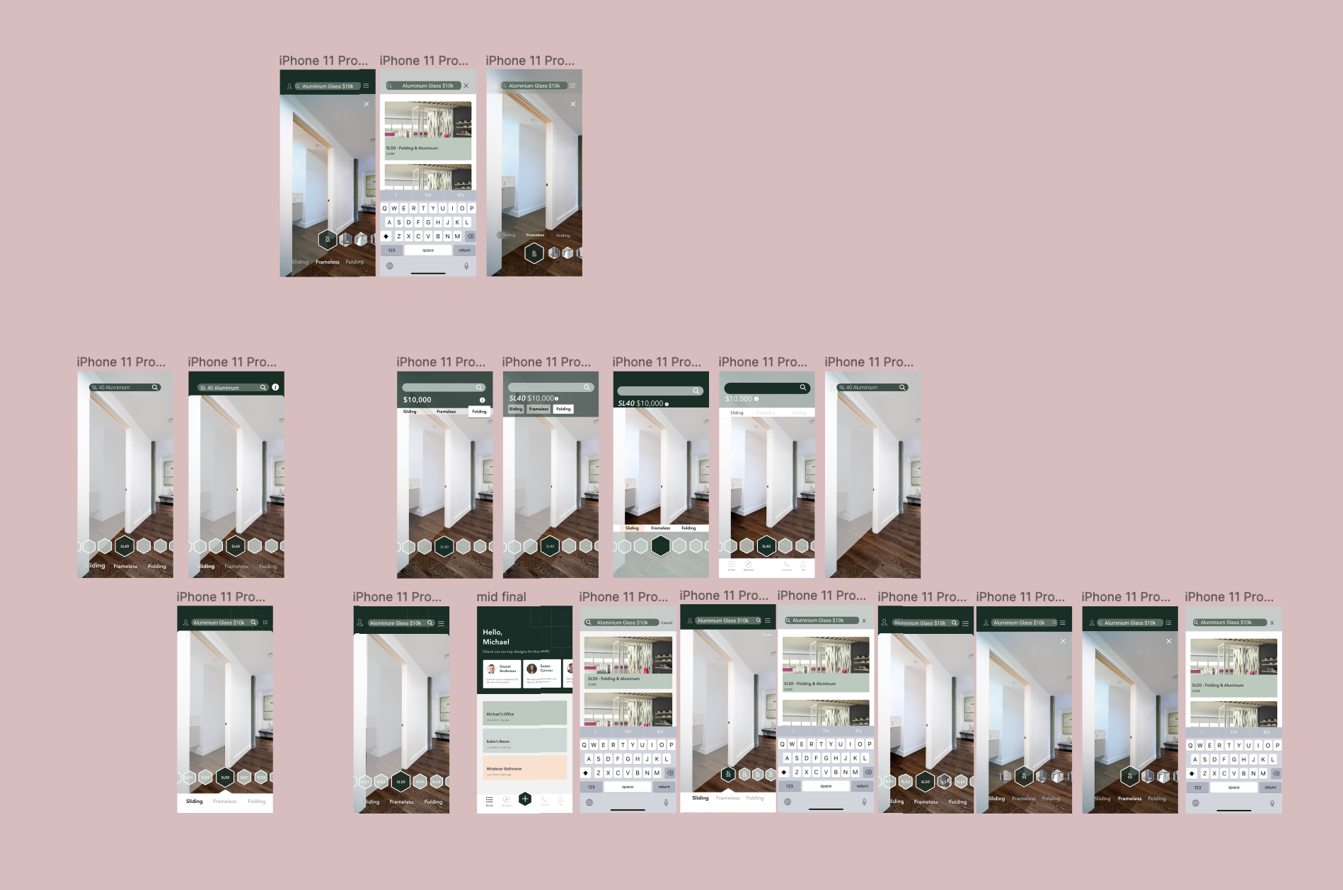
Home Page Attempts (Small) and Final (Large)
Simplifying the Try-On Experience
Additionally, to service the simplification of the try-on page, we all came with the hierarchy of NanaWalls products as per their website. The thought being that we would be able to find a simple sorting pattern instead of overloading our screen with filters and options.
We wanted to have even large groups of items so our initial inclination was to split it up by functionality as those groups were the largest therefore going into the next presentation we wanted to make sure that the interactions on that screen were sorted by that hierarchy.
-
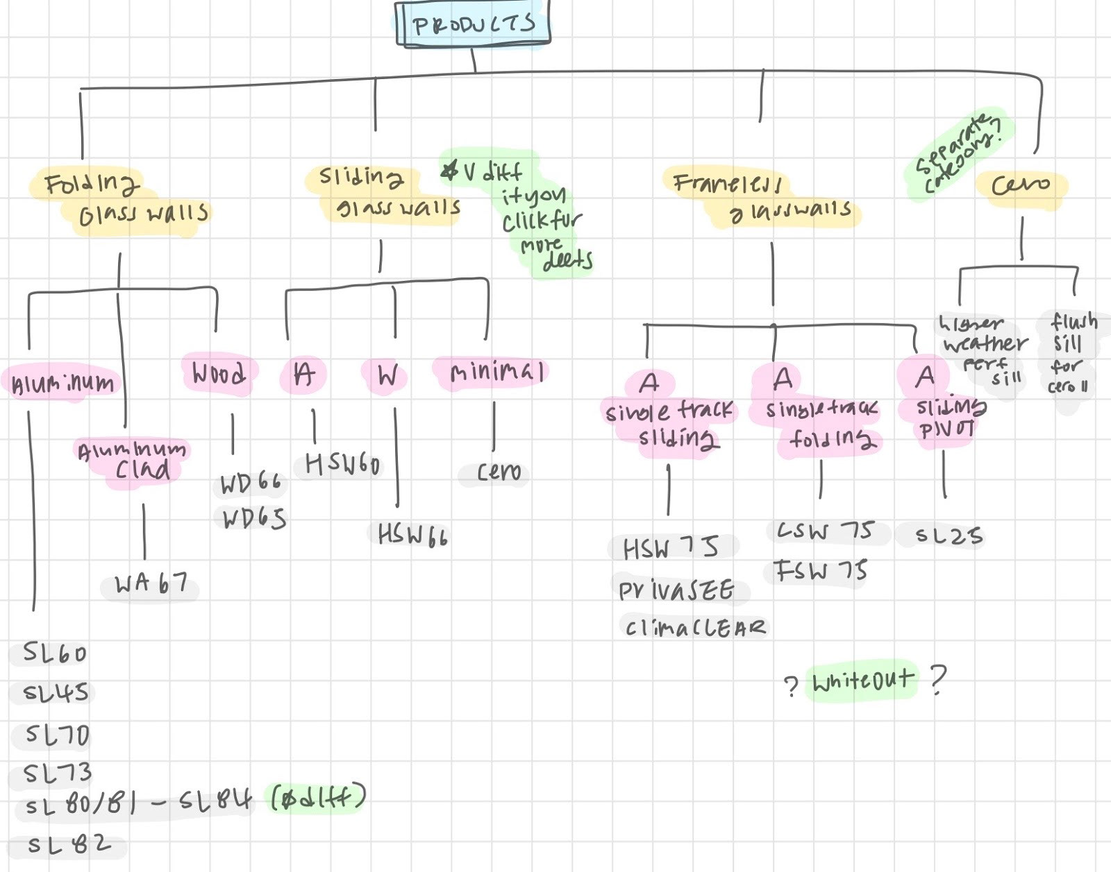
Higherarchy Used for Simplification of Try-On
-
With what needed to be on the AR search filter settled for the moment, we assigned individuals to create screens with two people (Celine and I) Working separately on the AR screen in the search screen as those screens or do you have the most complex and important and we wanted to have more options of how they were going to work as it seemed less straight forward.
Creating High Fidelity
Moving into high fidelity we combined Celine and I navigational systems to create one that has the best of our designs.
Our aim was to have the least visually obstructive interface while remaining in style and having all of the information needed to improve performance (model name, price, search, filter),
.
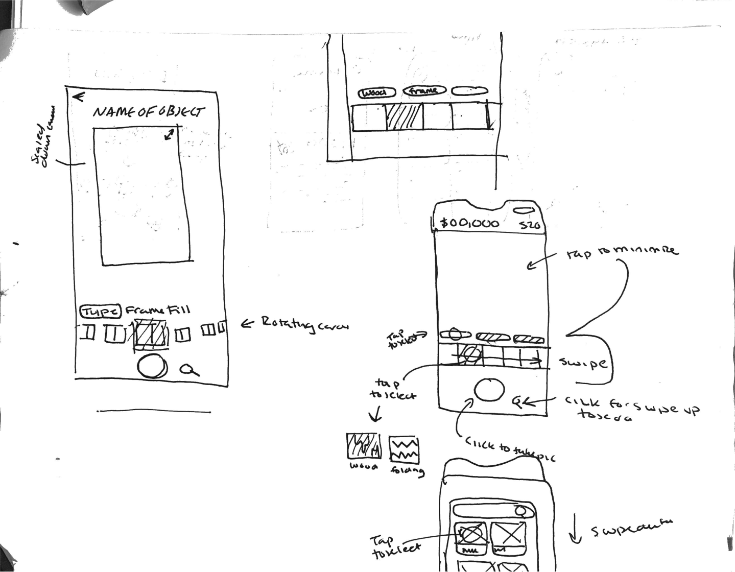
My Sketches of Try-On Before Meeting
.
,

Mid - High Fidelity Iteration of Flow w/ Comments and Rachel's (My) versions of the Try-On screen
Iteration 4/4
Final Design
Finalizing Design For Users & Stakeholders
Talking to our classmates helped us realize that we were wrong about our sorting hierarchy as our solution only considered the data and not the users. Users suggested we sort by material instead of function they would be looking for the "vibe" of items when imagining options with Nana wall and material was a better conveyer of "vibe" as it is what users thought was most crucial to something working in their space.
Besides that content change this stage was generally was about perfecting our design by making sure minor details aligned with the brands voice ( changing likes to bookmarks for example).
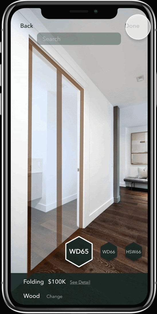
Seamless Try-On Experience
We designed a microinteraction to help users visualize how different products fit with their space and to compare the effects. When users switch between models, there is a short delay in transition so that users can see how the appearance of their space has gradually changed. The product mechanism and price details provided below will change as well to provide feedback. If users want to explore a different material, a tab bar will slide in from the bottom and with just one tap, users will be automatically redirected to the recommended model of that selected material. The design provides a seamless experience to prevent users from getting confused or overwhelmed within the AR tool.
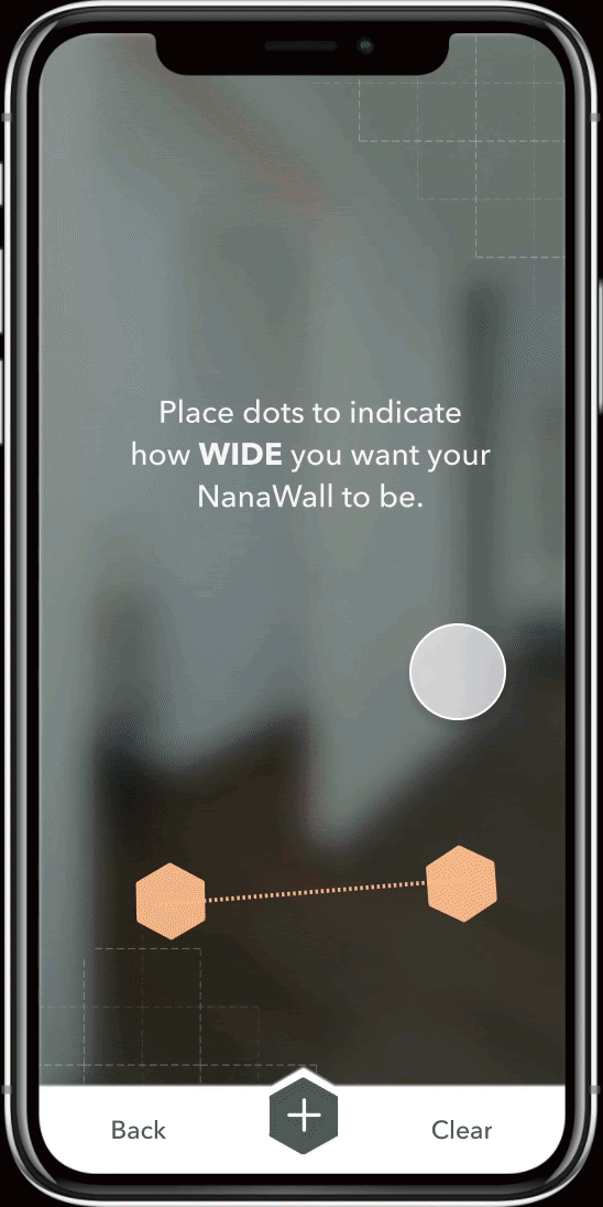
Two step AR Mesure
We designed a two-step measure functionality for users to get dimensions of their space. Users will be measuring width and height on separate screens to minimize their cognitive load. For each dimension, users only have to tap at the start point, drag, and release, after which a small tag will pop up indicating the exact number to provide instant feedback.
We also added animations to simulate users using a tape by having the dashed line heading towards the end point. The design provides a high match between system and the real world, guiding users subconsciously without making them think
Interactive All-In-One Form
All of us know the frustrations of being disturbed and asked to enter all kinds of information into a form, whether it’s creating an account or a project. This action can easily raise hackles and we don’t want to leave that burden on users.
To collect the necessary information without distracting users from their main flow, we embedded the form in a pop up modal with only three fields, project name, usage and space. Furthermore, we designed different interactions of data input including tabs and scroll bars. With a clean layout and entertaining interactions, we make it easy for users to proceed ahead.