Timeline
1 month
Tools
Figma, AfterEffects, Excel
Team
JT Aceron (MCHI 20')
Matthew Fang (IS+HCI 21')
Alice Li (MHCI 20')
Purpose
Large environmental displays that engage members of the public must be highly readable and easy to understand. Data-driven displays appear in sports stadiums, transportation facilities, hospitals, or stock trading floors. They create value for these transient groups of individuals by displaying the right data at the right time. So it is critically important for designers to know the data deeply and the needs of users and business stakeholders.
The goal of this project was to create a data driven display for the Atlantis hub with an external control that would provide value to all users and stakeholders.
My Contribution
In charge of motion (in addition to doing the motion taught others how to use AfterEffects as because they needed a chance to learn how). Created the final color scheme. Came up with the idea of PTF Express, the core feature of our design. My ordering of data was the basis of the grid.
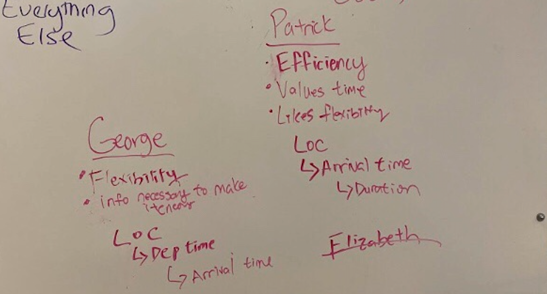
The first step in creating a useful data driven display (or anything for that matter) is to understand the context in which the display exists and the purpose it should serve. To aid in this we were given three (admittedly lackluster personas) from our professors. They are written bellow.
Elizabeth Duarte
Transportation Director of the Municipality of San Juan Islands
STAKEHOLDER
Elizabeth Duarte is the Transportation Director of the Municipality of the Greater San Juan Islands, a division of the local government that operates Atlantis Hub. Her department is responsible for displaying transportation data on large environmental displays in the airport, train stations, and ferry docks for Atlantis customers. In addition to offering highly readable displays of changing transportation data,
Elizabeth aims to educate the public about the ease with which travelers can make itineraries by combining plane, train, and ferry trips through her new program, the PTF Pass, which allows customers a great value and a lot of flexibility.
George Shimko
Property owner and retired resident of San Juan Islands
USER
A long-time resident of the San Juan Islands, George Shimko is an avid outdoorsman who owns modest fishing cabins on nearby Orcas Island and Stuart Island. He regularly invites his children and grandchildren to his house on San Juan Island and intends to give them PTF passes so that they can travel to Roche Habour, Yacht Haven, and Friday Harbour on San Juan Islands and to his cabins on Orcas Island and Stuart Island. He wants to be able to use his home on San Juan Island as a base so his guests can plan fun tourist itineraries.
Patrick Mulvaney
EnCo environmental engineer
USER
Patrick Mulvaney, is an environmental engineer for a EnCo, a large energy company in the region. As an engineer for EnCo who is stationed in Seattle, Patrick spends an average of three days per week visiting drilling and wind power sites throughout the San Juan Islands. Because weather often influences his travel from Seattle, through Victoria, and between the islands, Patrick welcomes the new PTF Pass program that allows his company to purchase multiple trips on planes, trains, and ferries so that he can optimize his travel on-the-fly, to accommodate changing weather conditions.
Before modeling the data, we first analyzed the personas given to us by writing their needs, values, and pain points. This would later direct us in modeling our data for the future data-display screen.
We saw how George was a family-man, who valued helping his family plan flexible trips. Patrick was a busy working man who valued efficiency and time. And our client, Elizabeth, wanted promotion of her special PTF Pass for the Atlantis Transportation Hub.
Modeling Our Data
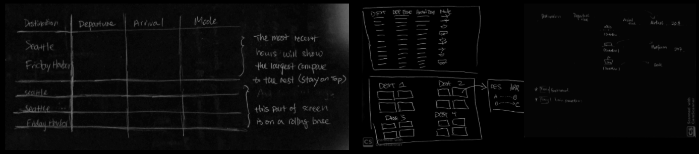
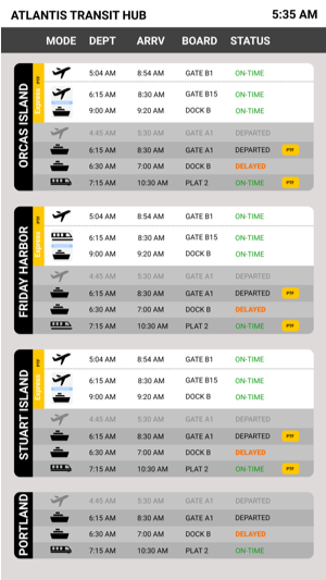
We then created a current-state model and saw that the majority of data was first categorized by modes of transportation. Within each mode, departure time was next in the hierarchy, and then information specific to each mode of transformation.
Then, relying on our personals we went on to create the future state model.
One of the major drivers of this ordering was that Elizabeth wanted to encourage transport by all the modes of PTF so we decided to group first not by mode of transport as before, but by destination as that was the primary concern of both of our users. Then, given, that departure time and making the gate was of primary concern to Pat. Departure time became our next sorting item, with arrivals after as the shortest total travel is the best option for Pat and in a rush he would want to find that first.
CREATING A BASE
To start off each member hand drew their own versions of sketches based off our future model. While our sketches were driven by emphasizing destination and departure time as having the greatest priority, this process showed how each of us also wanted to include other bits of information that we thought would be important. However, we had to remind ourselves that we were not designing for ourselves, but designing for George and Patrick. Touching base with our personas often helped us ensure our designs and goals were on the same page.
Adding EXPRESS PTF
During the first critique, I was listening to a group describe a map as a feature they had added as a way to make picking a new route easier. I liked the idea of connecting routes but I thought that looking at a map was far too confusing and overwhelming.
In response to this I came up with the idea of a recommended routes section which we would soon call PTF Express.
PTF Express adds value for all users and stakeholders.
For Elizabeth PTF Express highlights the flexibility of PTF to all visitors. For George PTF Express plans the trips for his grandchildren without the need for complex thought. For Pat PTF Express gives him the next available option if his flight is delayed.
Ultimately, each of these issues that PTF Express solves were central to each persona, and for that reason the recommended route was added into all of our future designs.
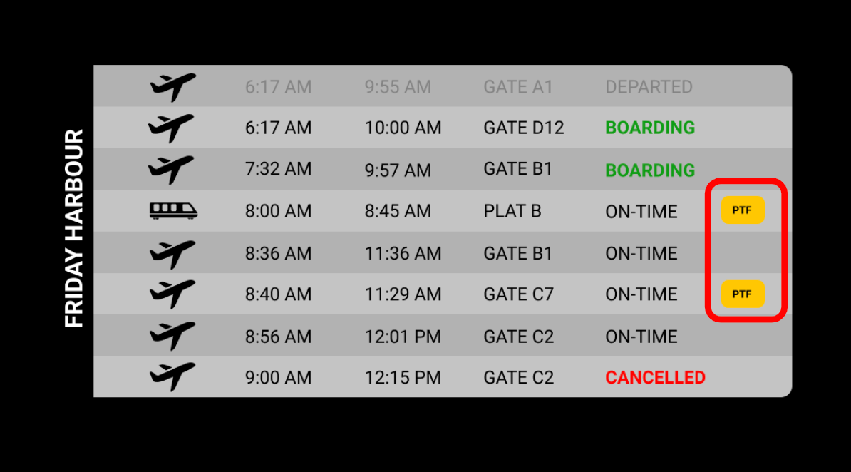
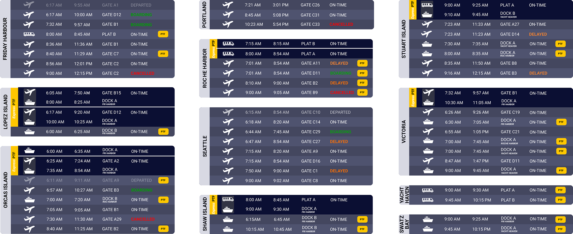
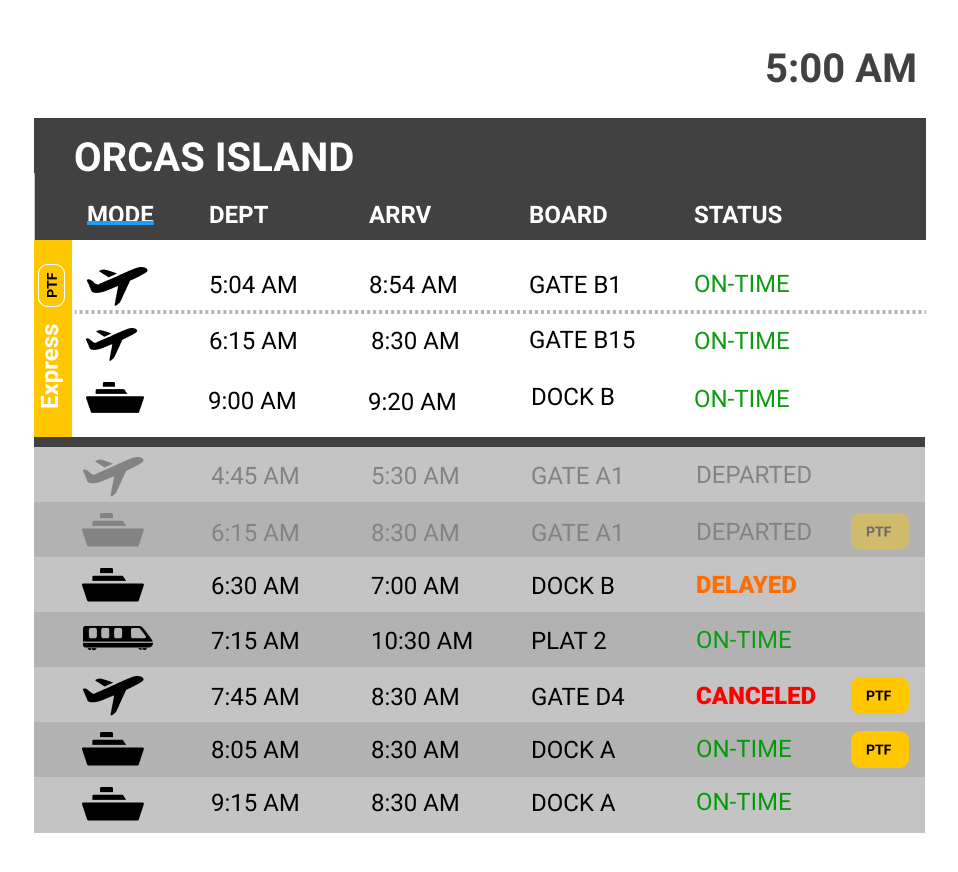
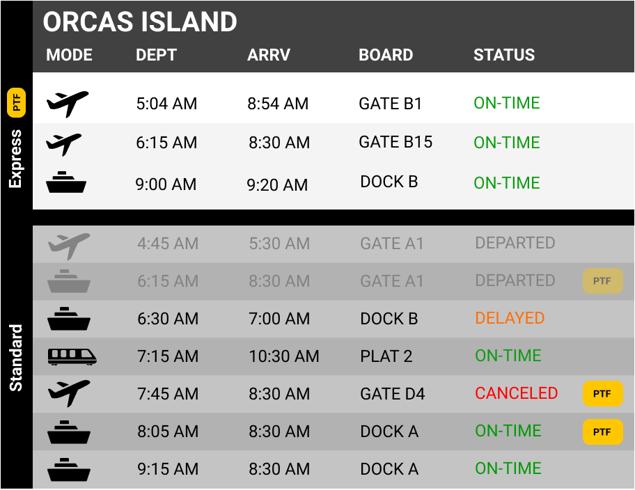
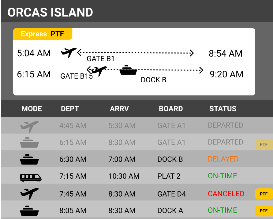
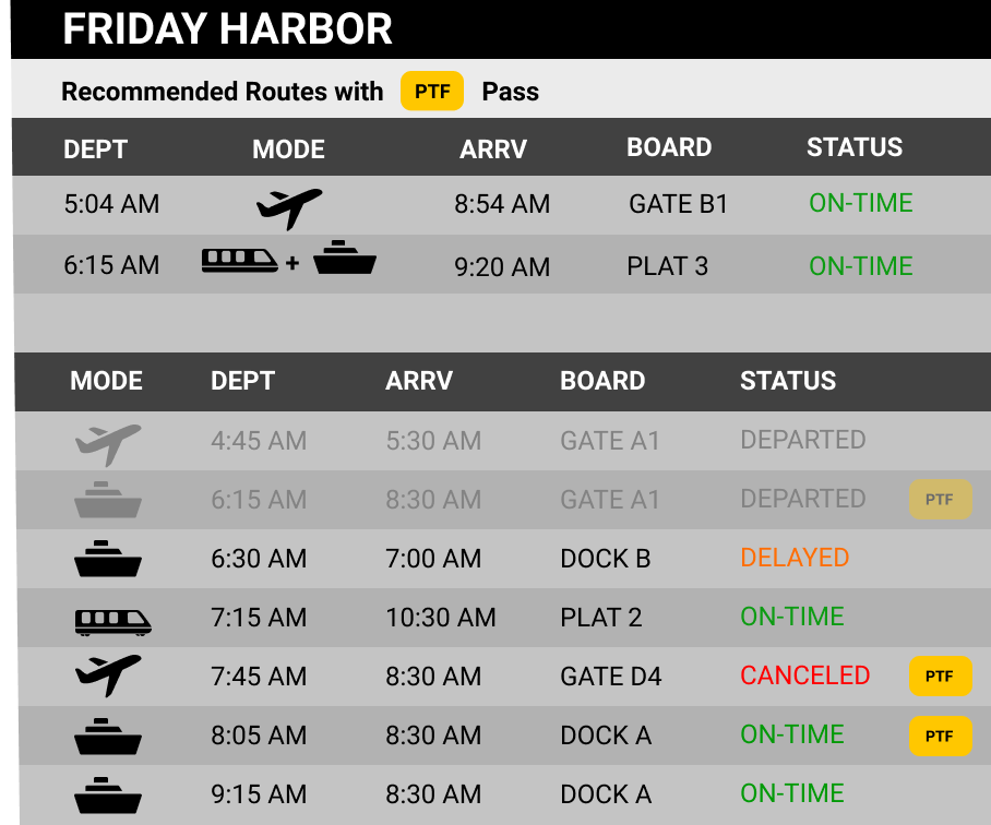
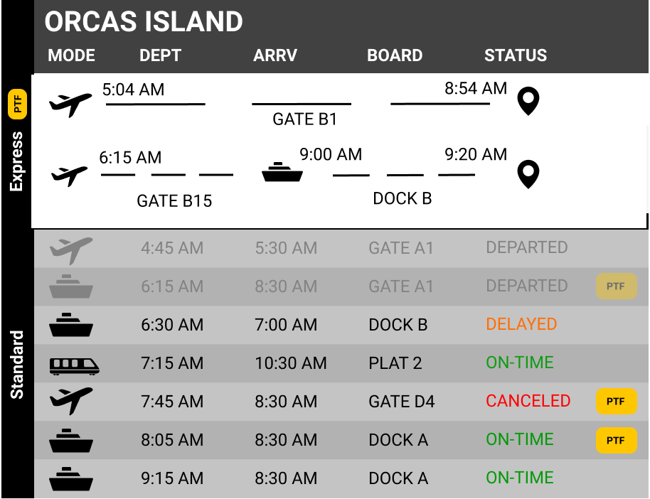
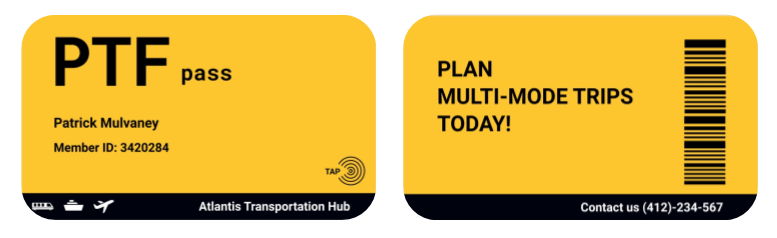
The Yellow Tag indicates the availability of the pass for certain trips

The PTF Express Section
First, our team agreed on using the choice of yellow for the PTF Pass. The high contrast yellow easily draws users’ attention to the tag for promotion.
The Yellow Tag indicates the availability of the pass for certain trips, so PTF users such as George and Patrick can identify this yellow tag to plan their trip easily.
We decided to put the yellow tag on the right side of the schedule and made it bright yellow but small. Thus, this tag does not annoy people by distracting them from reading their itineraries.
The PTF Express section helps the PTF pass holders plan the fastest route for certain destinations with easy mode switch. It saves users such as Patrick cognitive mental load by planning the fastest routes for him.
With these features in mind. Our group set off in a haste to create designs with these features.
When evaluating these prototypes we prioritized readability as they would be placed in a busy context.
Thus, we tested our design from varying distances and angles. We made sure the users from all angles within 1.5 meters had a good visual of the display and data.
The one on the right is was the base we chose.
Adding Arrivals
We realized that, while George's need to have his
The decision to add an arrivals section to our display came from the idea that George was not necessarily going on these trips, but was always waiting for members of his family to come home, so appears his need during this time an arrivals section was added at the bottom.

Finishing Touches
Formalizing What Data Would Be Displayed
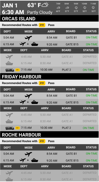
We decided to only display trip departure data within four hours because we believed none of the personas needed to know data for the entire day. We cleaned data in Excel file by extracting information that is needed:
- Destination, departure time, arrival time (calculated for the flight), Boarding location & status
- Color code the information by modes
- Order the data by destination alphabetically
- Rank the data within each destination by departure time chronologically
- Calculate plausible PTF express routes
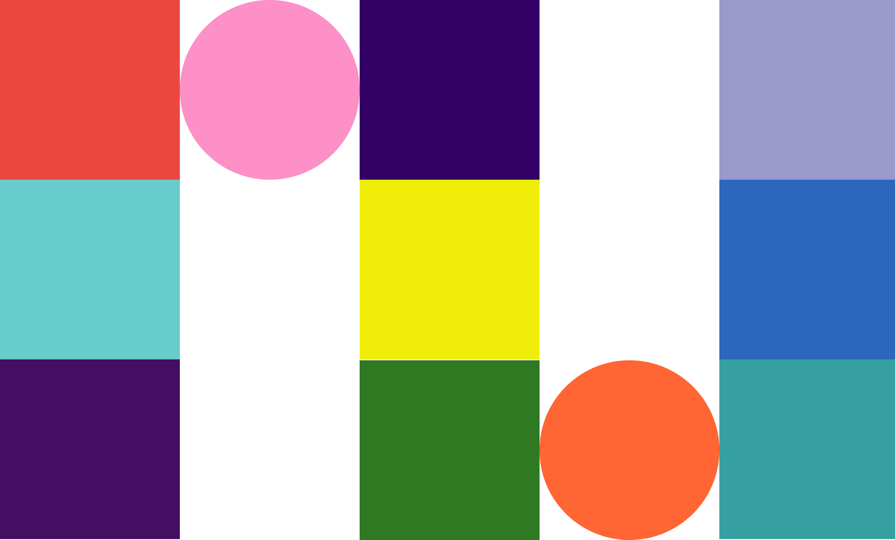
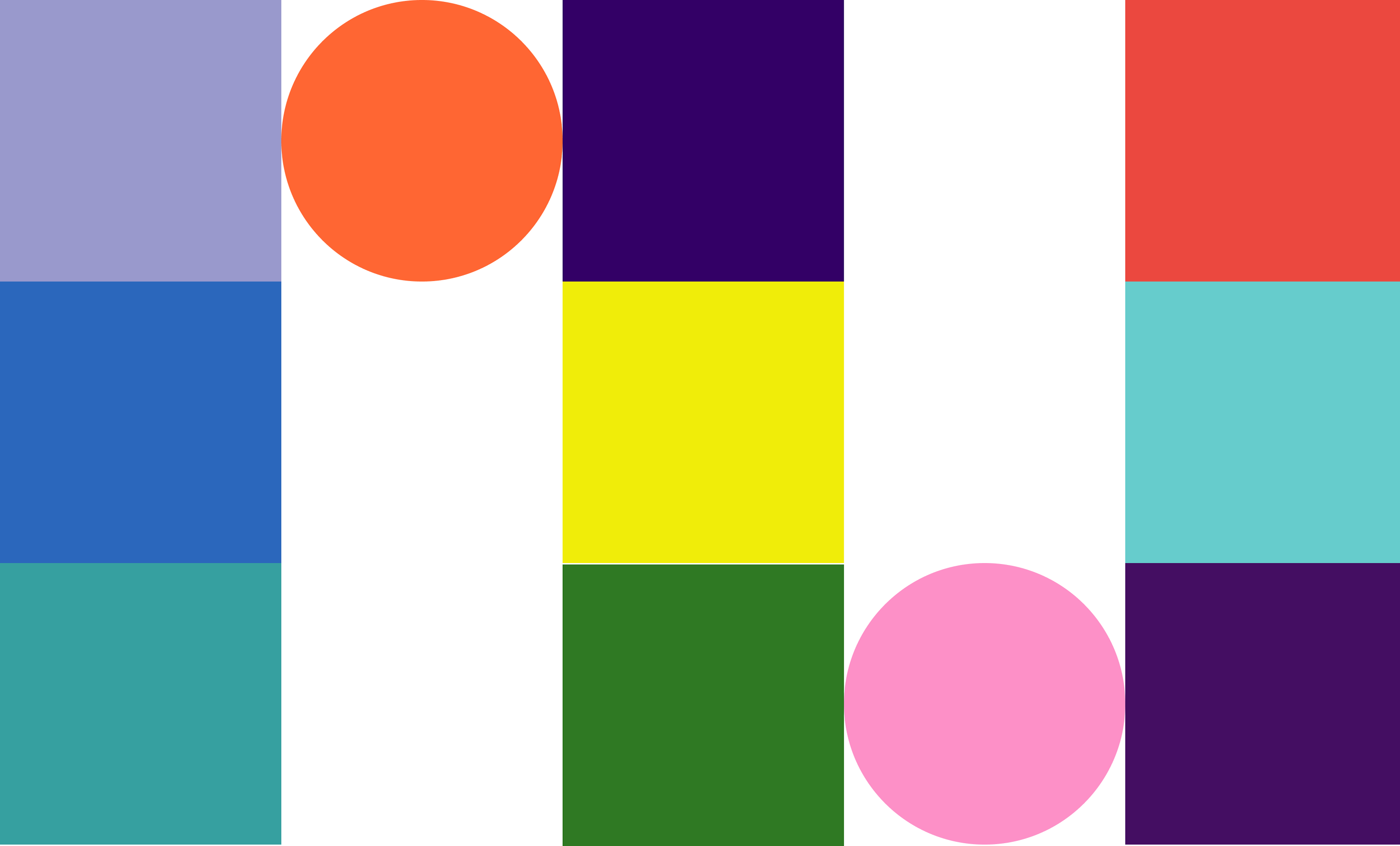
Finalizing Color
Color was something that we wanted to experiment and play with last. We prioritized the organization, separation, and placement of the data first. That’s why we chose to work largely in greyscale. After numerous rounds of feedback, we finally came to a final design and began to play with color. Because Elizabeth stressed readability, we wanted to ensure everything was easy to read with high contrast.
We played around with different “dark mode” themes because we felt this gave the best contrast while maintaining aesthetics. The final design is largely dark blue/black with color only being used to show significance. The yellow PTF pass would draw customer attention. We also used color to display all the different types of statuses for the trips. That way the user can infer that if it’s colorful it’s important.

Finalizing Motion
We designed our departures section primarily to reduce search difficulty and to ensure that motion would not disrupt that search. The transition between departure cards is 15 seconds, which is enough time for Patrick to search for his flight, but short enough so that he will only have to wait a max of 30 seconds before his slide reappears (our design has 3 screens). Additionally, we designed the arrivals section to continuously scroll to the left so George could easily see his family arrive at the Hub.
We tested this by giving our classmates tasks of finding the gate of a specific flight and this seemed to be the point where the majority of users would be able to find the spot after this the utility of each additional second diminished.

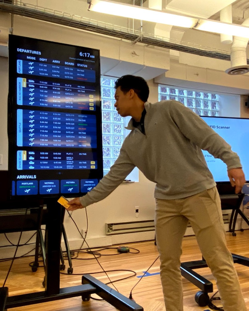
Bringing PTF to Life
After finalizing our screens. We sought to add depth to the experience though adding interactivity.
Based on the personas needs, we wanted to create a control for this display needed to have minimal public disturbance for George and Patrick while implicitly advertising the benefits of the PTF Pass. Our solution was to place a RFID chip inside the physical PTF pass.
The chip allows PTF members to use their exclusive PTF pass member card too quickly find and locate their trip information by tapping their pass at the bottom of the screen. After which the cardholders scheduled destination would Highlight
The goal is for the motion to be jarring enough for those who are expecting it to use it as a tool, and subtle enough that other patrons are not distracted.
The highlight of the card lasts 2 seconds as that was in our tests enough to draw the eye of a user from the placed they tapped to the highlighted spot on the screen.
The pagination dot that is highlighted when the screen containing the proper info is not currently shown lasts 4 seconds with the last two being a fade (and the first two for processing that no row is highlighted).
This change in opacity is intended to draw the eye of the viewer to the dots on the otherwise stable screen.
Reflection
Throughout the design process, it was easy for our team to “design for ourselves” instead of designing for the personas. When we discussed ideas, we would sometimes bring up ideas that would benefit us if we went to the Atlantis Transportation Hub, but not George or Patrick. It was more difficult to reach consensus in team decisions when we designed for ourselves (i.e. when we had at least 5-6 different versions for our initial prototypes), but whenever we framed everything in the point of view of our stakeholders, our design flow was smoother.